Renovating and Extending a Listed Period Cottage, Part Two
A few months ago I posted the blog
‘Renovating and Extending a Listed Period Cottage, Part 1’
One of the points, I discussed was how I made a plan with my clients to seamlessly blend the best features of a listed period cottage with some more contemporary styling appropriate for modern living.
The main hurdle to overcome was the mix of aesthetics for the house as it currently stood, with the plants to modernise, update and extend it. The house was a Victorian Grade 2 Listed cottage, with oak beams and wobbly walls, with a triple garage on the ground floor. This garage was to be remodelled with an added glazed extension, complete with lift and all new fittings. When finished, this new extension would house a large, contemporary, open plan kitchen, dining and living space, with bi-folding doors opening onto the garden.

Avoiding a clash of styles
To prevent a stylistic clash between the interiors of the rest of the cottage and the new extension, the interior design of the cottage was to have a complete overhaul. This would include space planning, styling, colours and furnishings for each room, including the fitting of new windows throughout.
In ‘Part One’, I showed some mood boards I created to give the clients a feel for how we might best approach the project.
So how did it all work out? Did everything go according to plan?
A year and a half down the line, with all the work now complete, let’s take a look…

The biggest challenge
Finding a way to soften the clients’ existing furniture and decorative items and to gauge the right choice for lighting and soft furnishings to best suit the aesthetics of both ‘period’ and ‘modern’ was the biggest challenge. The furniture from their previous house, which the clients wanted to keep, included glossy velvets and shiny fabrics on upholstered items. So for the redesign, I softened the mood by introducing some natural materials, linens and wools, and some large, modern pieces of furniture from Tom Faulkner and Julian Chichester

Clean lines
We went for clean-lined kitchen cabinets in a pale grey, offset by the walnut bookcase joinery in the dining area, which echoed the darker porcelain wood flooring. I designed these myself, they were then detailed and made by Alex at Boffe. The finishing touch on the cabinets were the handmade bronze handles by Ged Kennett.

An inspired choice
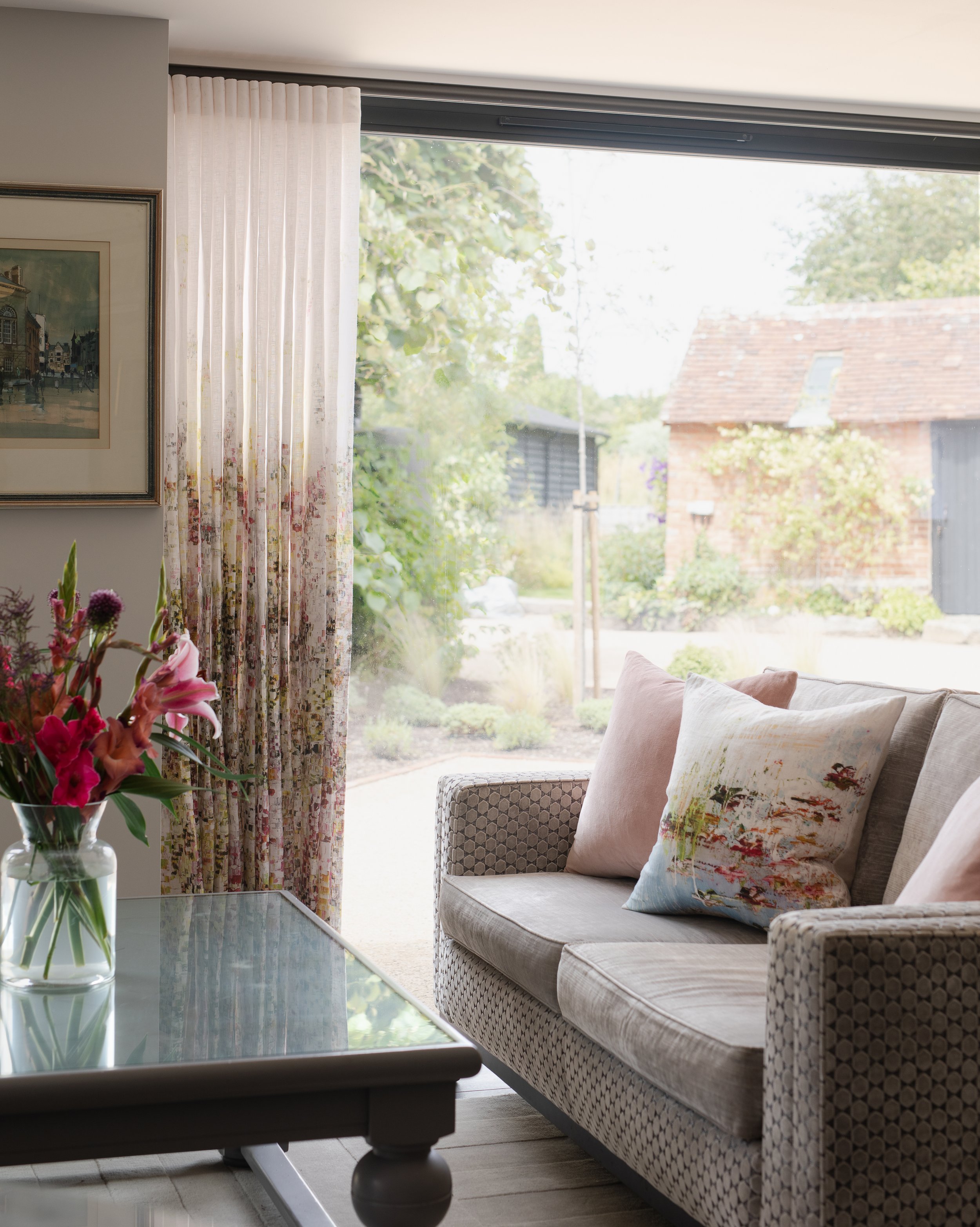
We opted for soft quiet floral curtains by Jessica Zoob for Black Edition for the open plan space downstairs. These were a strategic choice as voile curtains were a much better fit for the light and airy atmosphere in the space than heavy window coverage would have been.
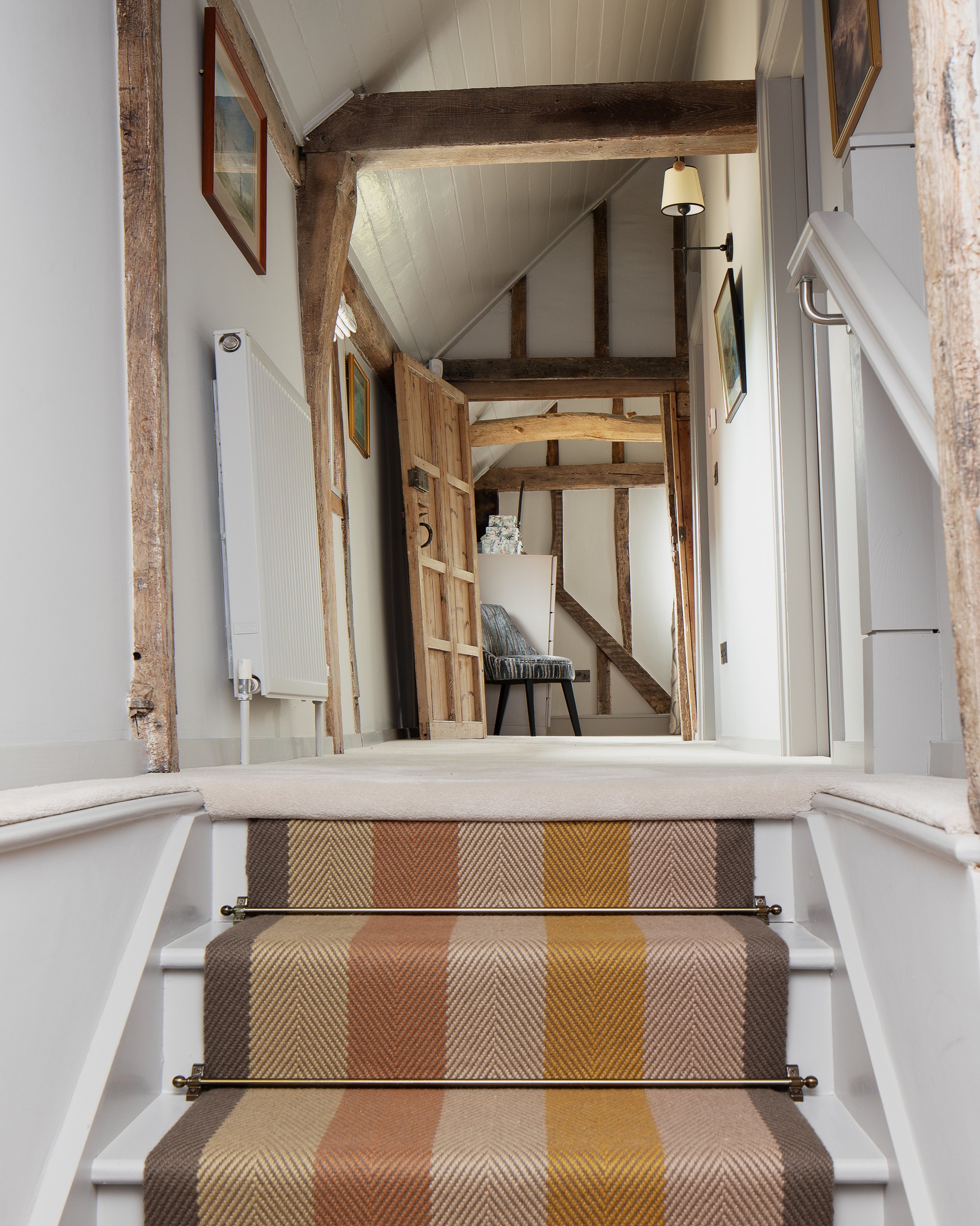
The striped runner on the stairs in beige, brown and mustard went beautifully with these and linked nicely with the palette in the master bedroom.
<img src="https://images.squarespace-cdn.com/content/v1/56d2dab43c44d801f475de62/1692475515278-YR0U2KQ7IFFGUQOBS0TW/Cottage+conversion+velvet+sofa+and+floral+curtain.jpg" alt="Cottage conversion velvet sofa and floral curtain.jpg" />
<img src="https://images.squarespace-cdn.com/content/v1/56d2dab43c44d801f475de62/1692475508172-AEQWIP63CMRX0EQLVO0I/Cottage+conversion+stairs+with+striped+runner.jpg" alt="Cottage conversion stairs with striped runner.jpg" />
#block-yui_3_17_2_1_1692474715277_46449 .sqs-gallery-block-grid .sqs-gallery-design-grid { margin-right: -20px; }#block-yui_3_17_2_1_1692474715277_46449 .sqs-gallery-block-grid .sqs-gallery-design-grid-slide .margin-wrapper { margin-right: 20px; margin-bottom: 20px; }
Floral print, for a cottage-y feel
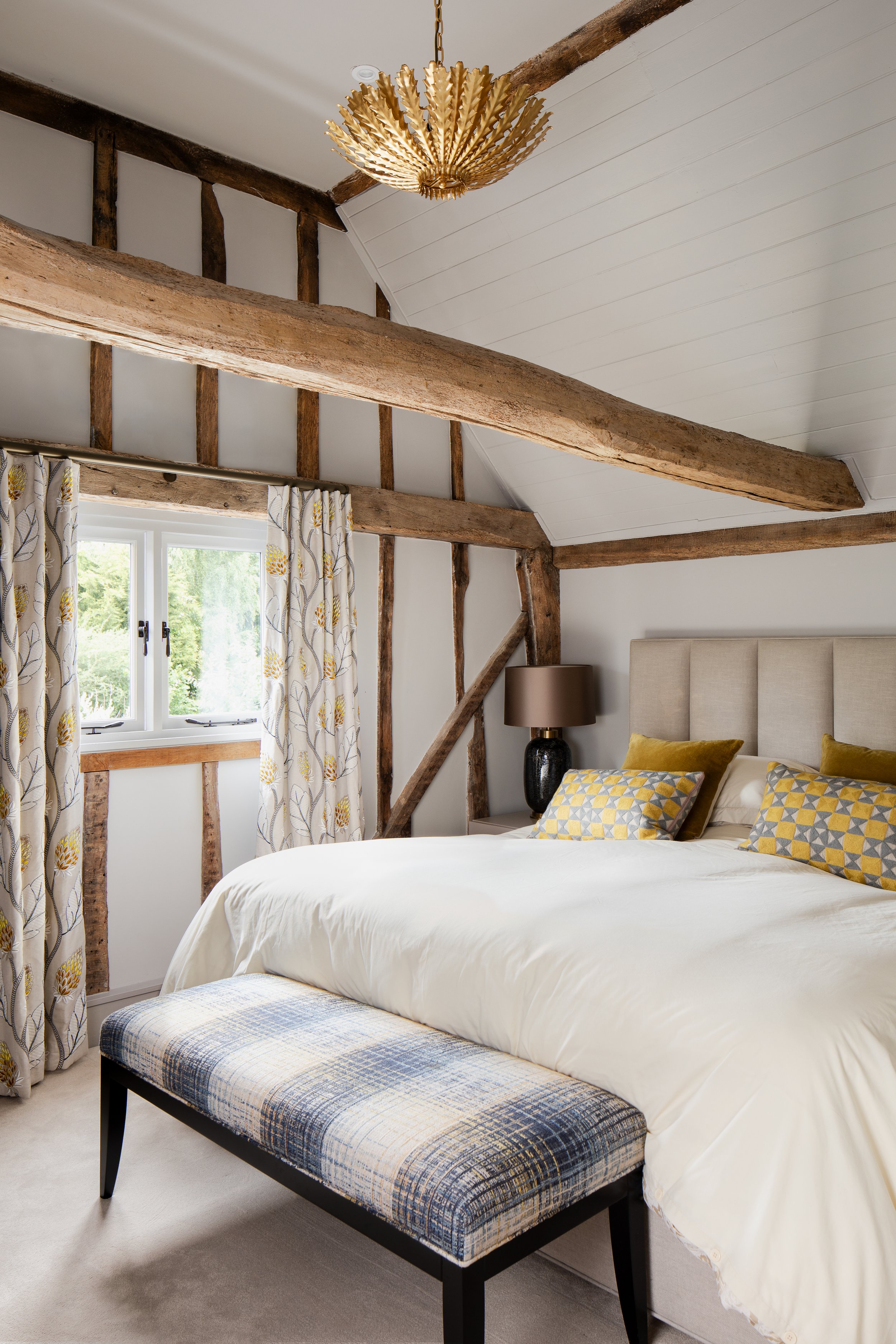
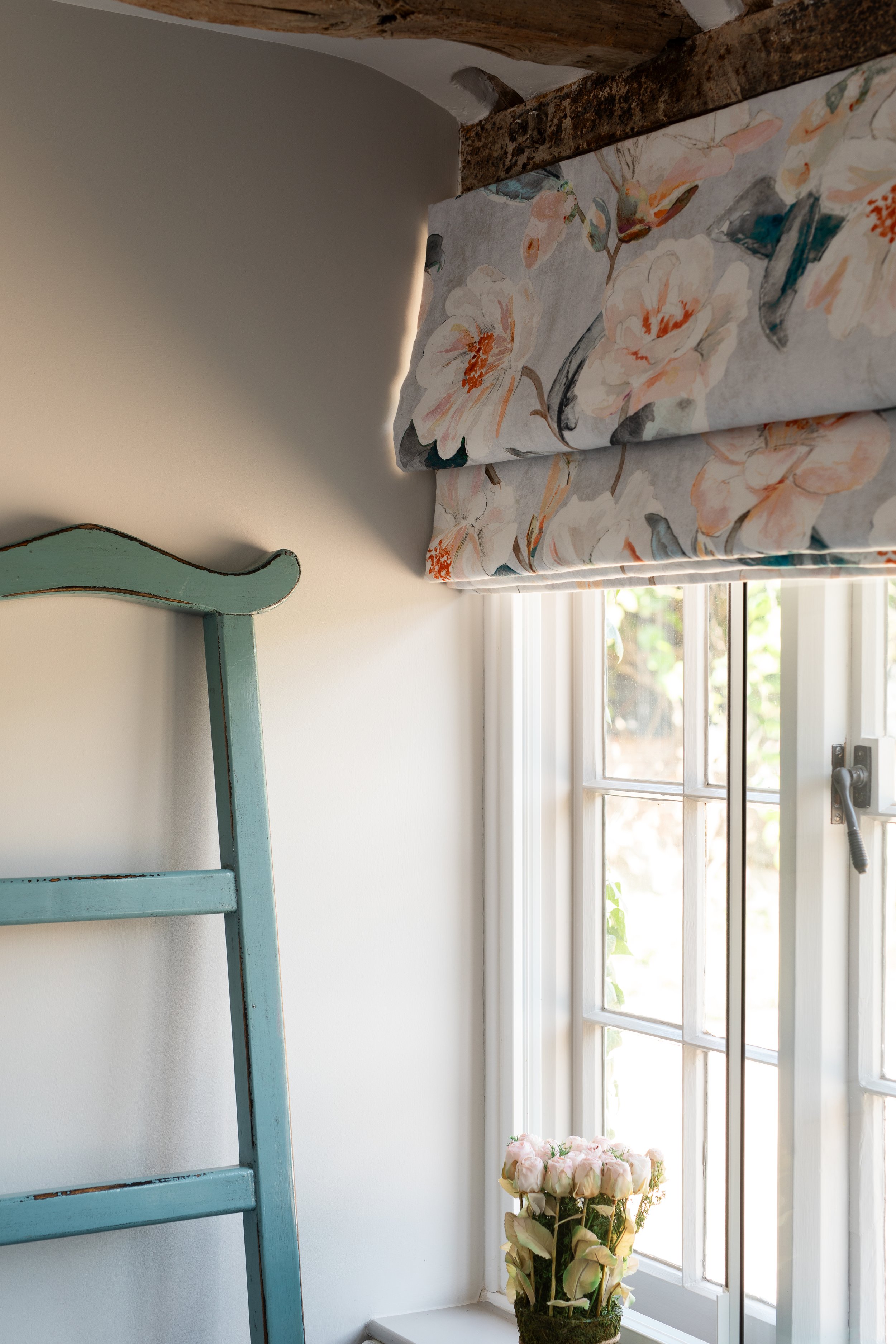
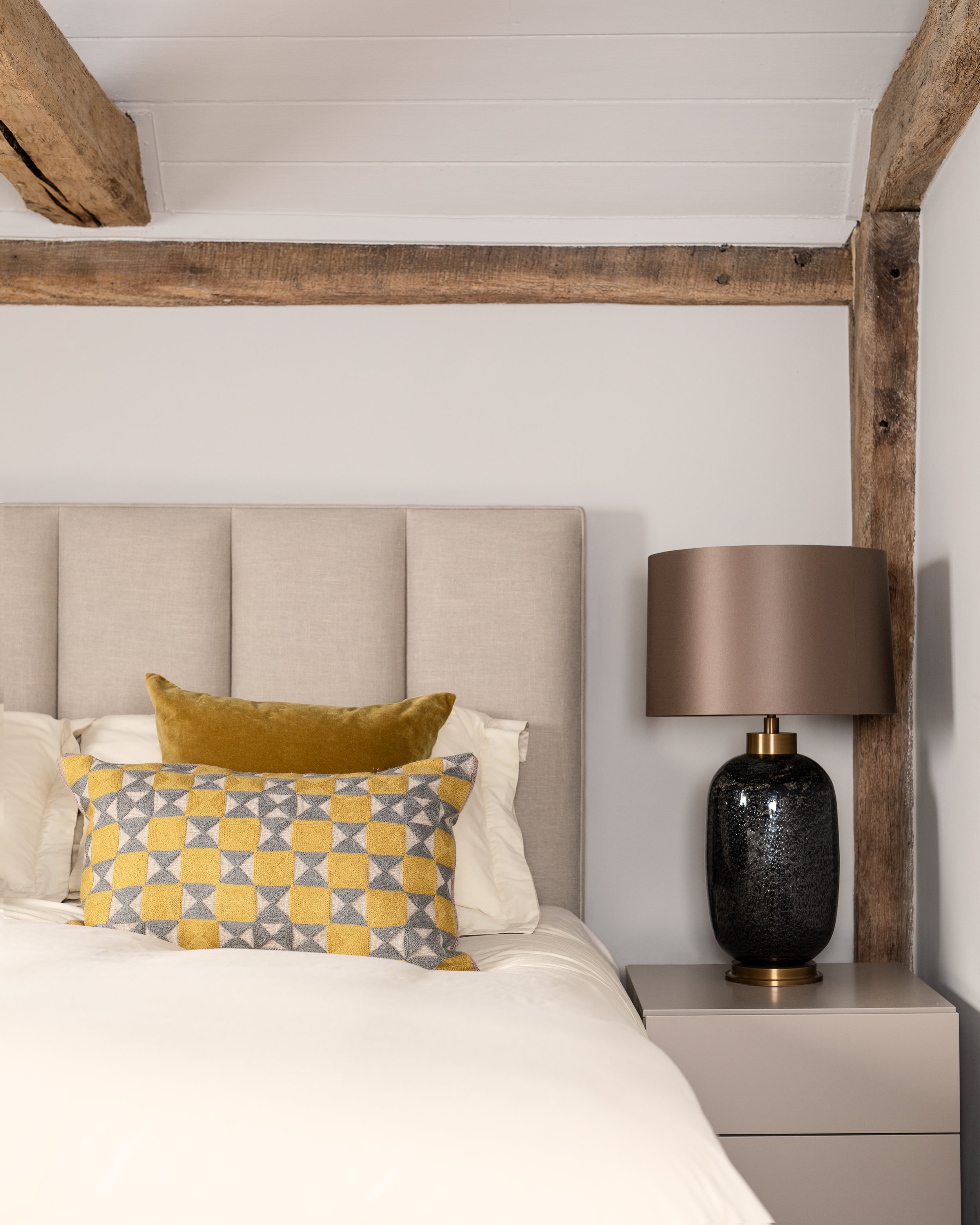
We chose embroidered floral linen curtains from James Hare in the master bedroom, and a simple floral print for the guest bedroom, beautifully made by Natasha Davies Interiors which helped retain something of the ‘cottage-y’ feel.
<img src="https://images.squarespace-cdn.com/content/v1/56d2dab43c44d801f475de62/1692475689253-QSKUNK7R63DYGYB2GU80/Cottage+conversion+bedroom+with+oak+beams.jpg" alt="Cottage conversion bedroom with oak beams.jpg" />
<img src="https://images.squarespace-cdn.com/content/v1/56d2dab43c44d801f475de62/1692476222858-1RU4HU8PN8NLY9O3VM8I/Cottage+blue+bedroom+with+window.jpg" alt="Cottage blue bedroom with window.jpg" />
#block-yui_3_17_2_1_1692474715277_71088 .sqs-gallery-block-grid .sqs-gallery-design-grid { margin-right: -20px; }#block-yui_3_17_2_1_1692474715277_71088 .sqs-gallery-block-grid .sqs-gallery-design-grid-slide .margin-wrapper { margin-right: 20px; margin-bottom: 20px; }
Introducing softer shapes for a soothing atmosphere
The clients already had sculptural bronze light fittings, so we added more of the same, using these to create a more calm and soothing atmosphere with the introduction of softer shapes.
We chose Thomas O’Brien wall lights in the hall/stairs/landing, a Soho Home pendant in the guest bedroom and an Aerin gilt chandelier in the master bedroom.
Classic tiling and bespoke joinery blend traditional and contemporary
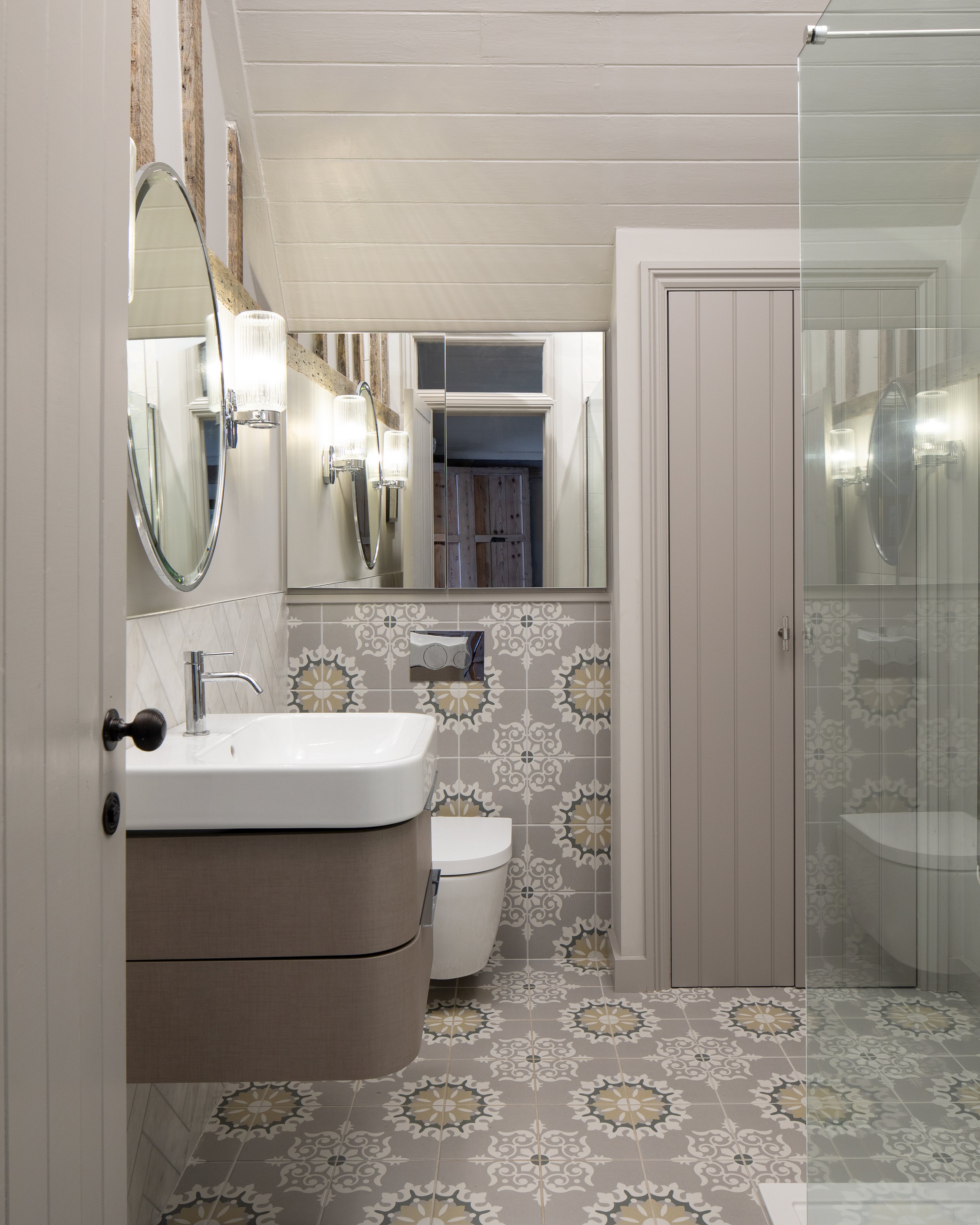
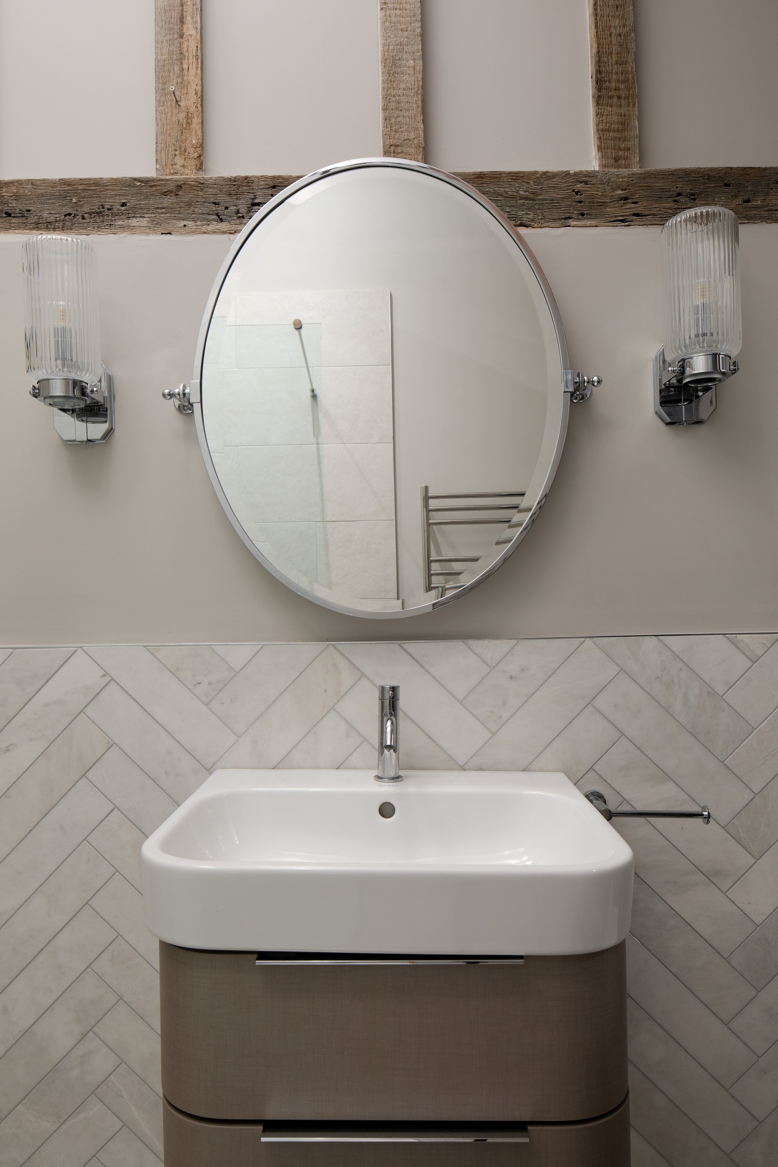
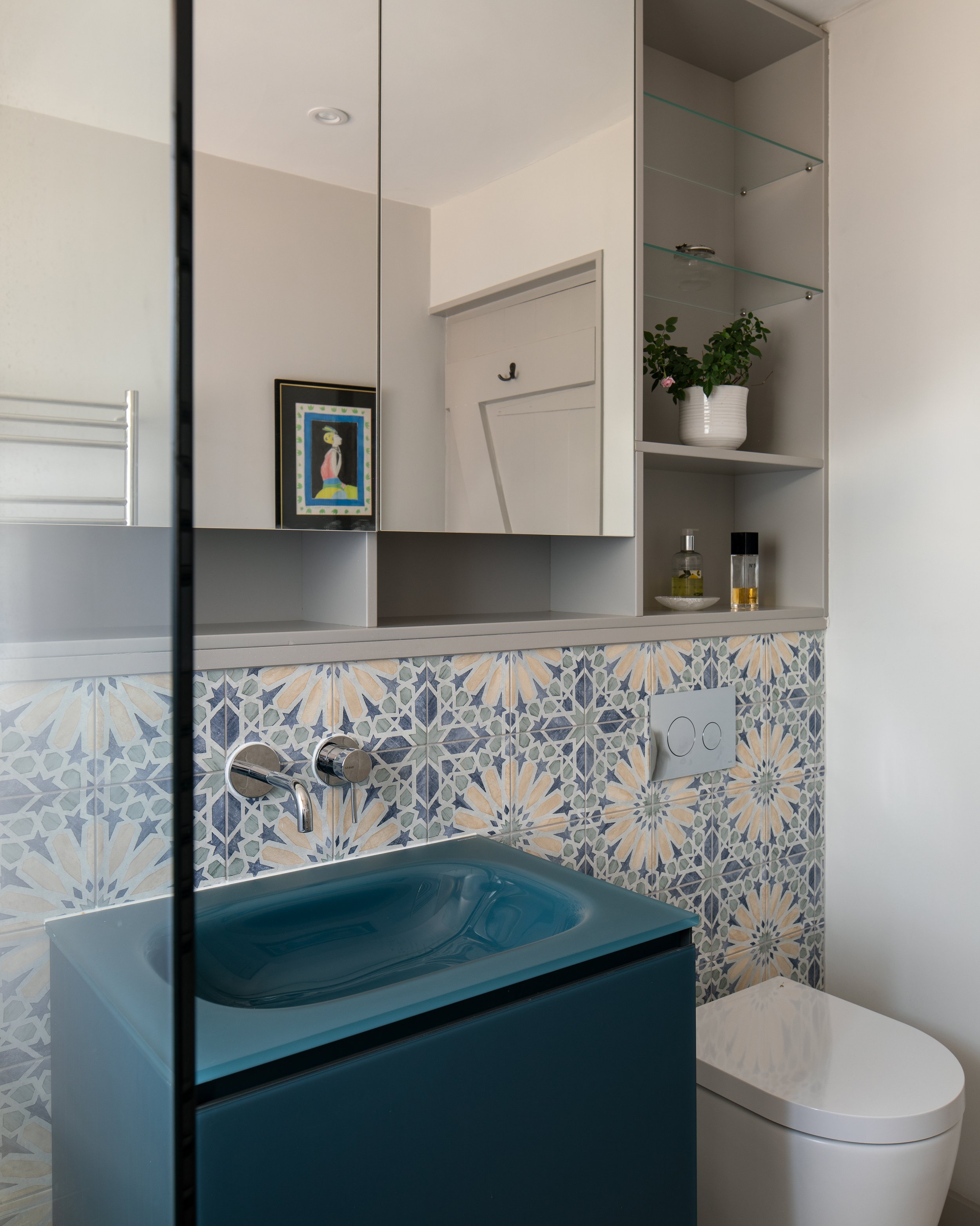
I purposely designed the interior styling for the bathrooms to match their respective bedrooms. Here, again, I was using a blend of modern fittings with classic tiling and bespoke joinery to make neat, well-organised and comfortable bathrooms featuring a mix of the traditional and contemporary. The fittings came mostly from Duravit and Drummonds.
The pictures below show how we matched the master bedroom and bathroom by using a subtle mix of grey and mustard.
<img src="https://images.squarespace-cdn.com/content/v1/56d2dab43c44d801f475de62/1692476017759-7TANN2T629SVG8RD3GSD/Cottage+conversion+bedroom+with+headboard.jpg" alt="Cottage conversion bedroom with headboard.jpg" />
<img src="https://images.squarespace-cdn.com/content/v1/56d2dab43c44d801f475de62/1692475995459-VXIAXF0WUU2BZTAUM7ZR/Cottage+conversion+bathroom+with+grey+patterned+tiles.jpg" alt="Cottage conversion bathroom with grey patterned tiles.jpg" />
<img src="https://images.squarespace-cdn.com/content/v1/56d2dab43c44d801f475de62/1692476119348-EDH7G30SIULM36GFGE7O/Cottage+conversion+bathroom+with+vanity+and+mirror.jpg" alt="Cottage conversion bathroom with vanity and mirror.jpg" />
#block-yui_3_17_2_1_1692474715277_105752 .sqs-gallery-block-grid .sqs-gallery-design-grid { margin-right: -20px; }#block-yui_3_17_2_1_1692474715277_105752 .sqs-gallery-block-grid .sqs-gallery-design-grid-slide .margin-wrapper { margin-right: 20px; margin-bottom: 20px; }
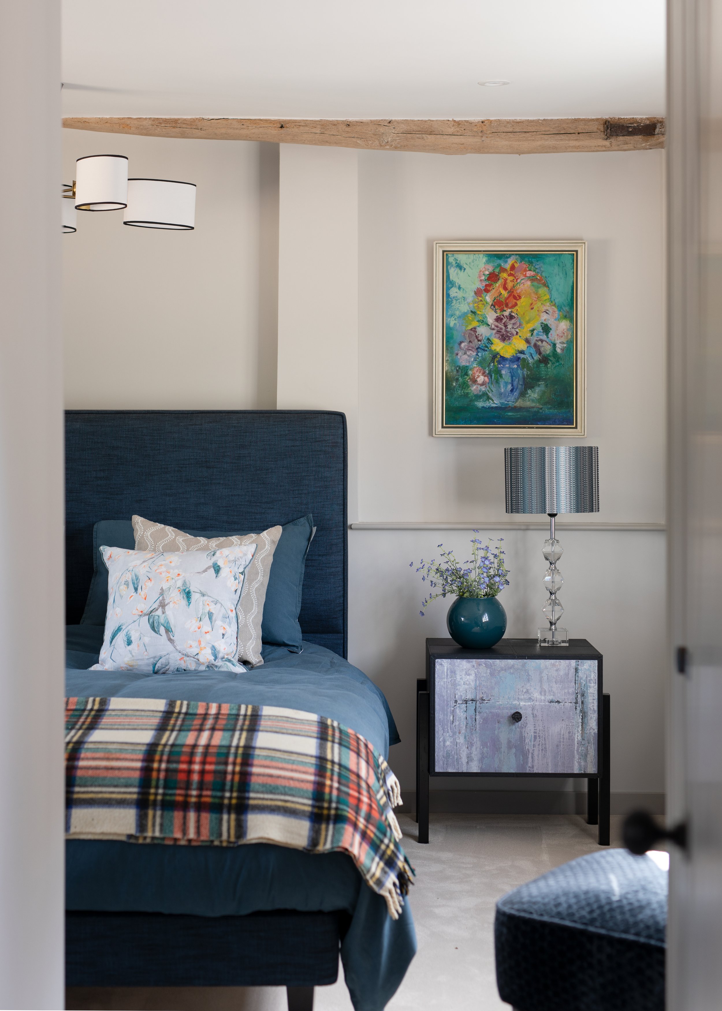
The blue palette for the guest suite echoed the clients art work and added to the modern rustic design direction for the house. You can see in the images below how well it worked here in the guest bedroom and bathroom.
<img src="https://images.squarespace-cdn.com/content/v1/56d2dab43c44d801f475de62/1692476303589-AT7T4GMH6LHNB7NV45IR/Cottage+blue+bedroom.jpg" alt="Cottage blue bedroom.jpg" />
<img src="https://images.squarespace-cdn.com/content/v1/56d2dab43c44d801f475de62/1692476157257-HXSZJCZOM2MI2XXMQT9V/Cottage+conversion+blue+bathroom+with+bespoke+cabinetry.jpg" alt="Cottage conversion blue bathroom with bespoke cabinetry.jpg" />
#block-yui_3_17_2_1_1692474715277_135773 .sqs-gallery-block-grid .sqs-gallery-design-grid { margin-right: -20px; }#block-yui_3_17_2_1_1692474715277_135773 .sqs-gallery-block-grid .sqs-gallery-design-grid-slide .margin-wrapper { margin-right: 20px; margin-bottom: 20px; }
Successfully marrying two distinct styles
So, this is how I overcame the challenge of marrying two very distinct styles – the period traditional with the contemporary and modern. We did this by making considered design choices and allowing the more contemporary pieces and colour choices to respect and blend with the traditional features of a period property. The clients, who were a pleasure to work with throughout, were delighted with the end result.
All photos, credit Matt Gamble Photography
I love providing interior design direction for family homes, considering colour, furnishings, flooring and lighting, along with family living, with an element of indulgence, a little bit of drama and plenty of personality.
If you would like a hand creating your dream home or want a second opinion, give me a call, 07773 372 158, or send me an email via nicky@nickypercival.co.uk
I look forward to hearing from you.
Nicky