Every Corner Tells A Story
Do you have any corners in your house that may have been neglected over the years and could do with a new lease of life?
When designing the interior of our homes and considering the best use of the available space, much of our attention will be focused on flooring, furnishings, lighting and wall décor. This is only natural, of course, but corners can often be overlooked – or sometimes forgotten about altogether.
In this blog, we will look at three properties I worked on recently with clients who each had their own, subtly differing, tastes. But rather than discussing the entire project, I’ll show how we managed to give some important corners a character of their own, whilst still allowing them to blend beautifully with the more general feel of the overall space…
#1 Barn conversion focal point
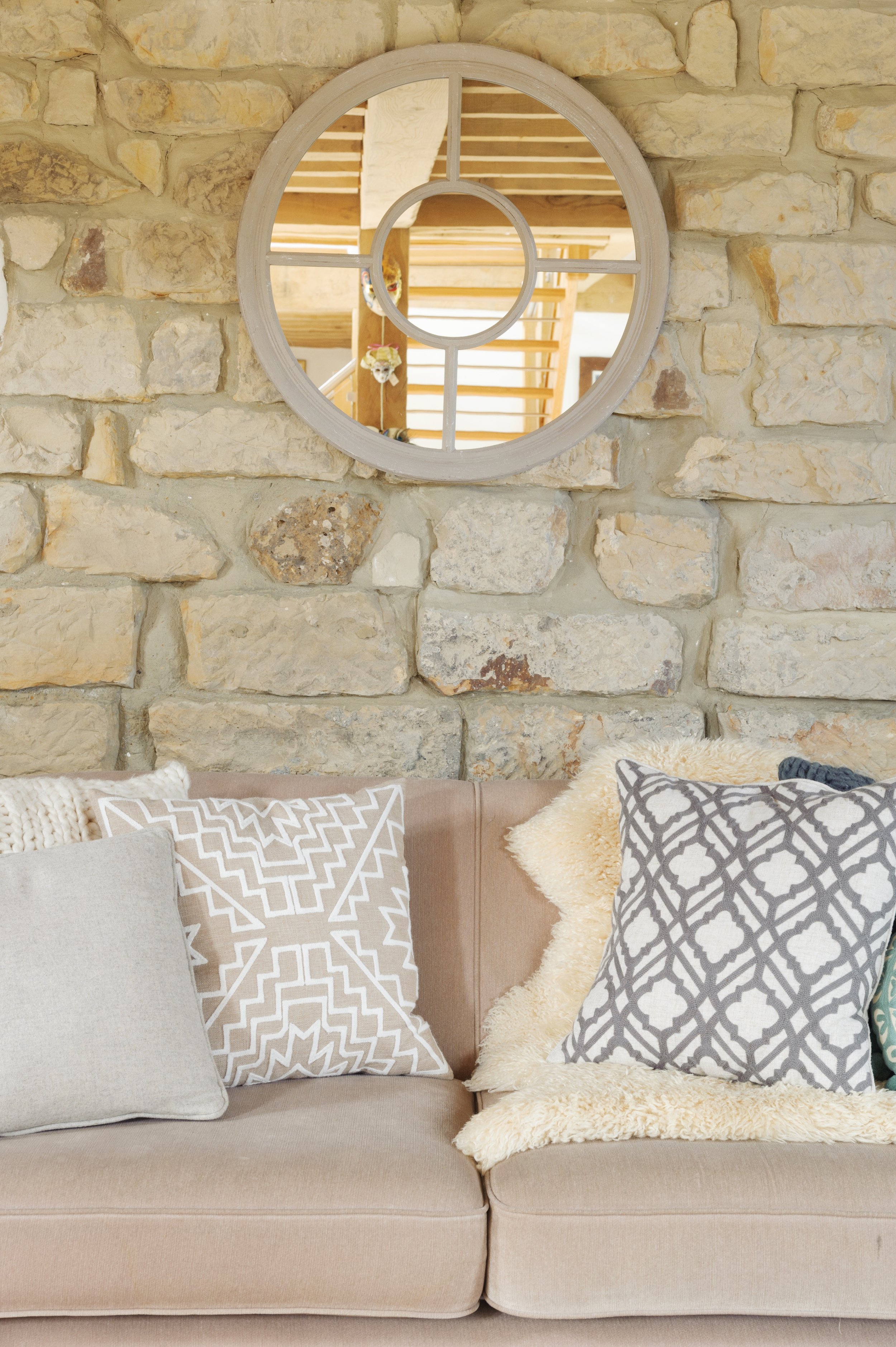
Placing the wood-burning stove in the corner allowed the sofas to provide a frame which naturally draws the eye towards the burner in the centre, which becomes the focal point. What was previously little more than a corridor leading to a home office was now a cosy space with its own, welcoming vibe. Children could use it as a ‘hangout’, with the views to the garden and courtyard also making it a pleasant place for adults to relax and enjoy some ‘downtime’.

Rustic feel and connection to nature
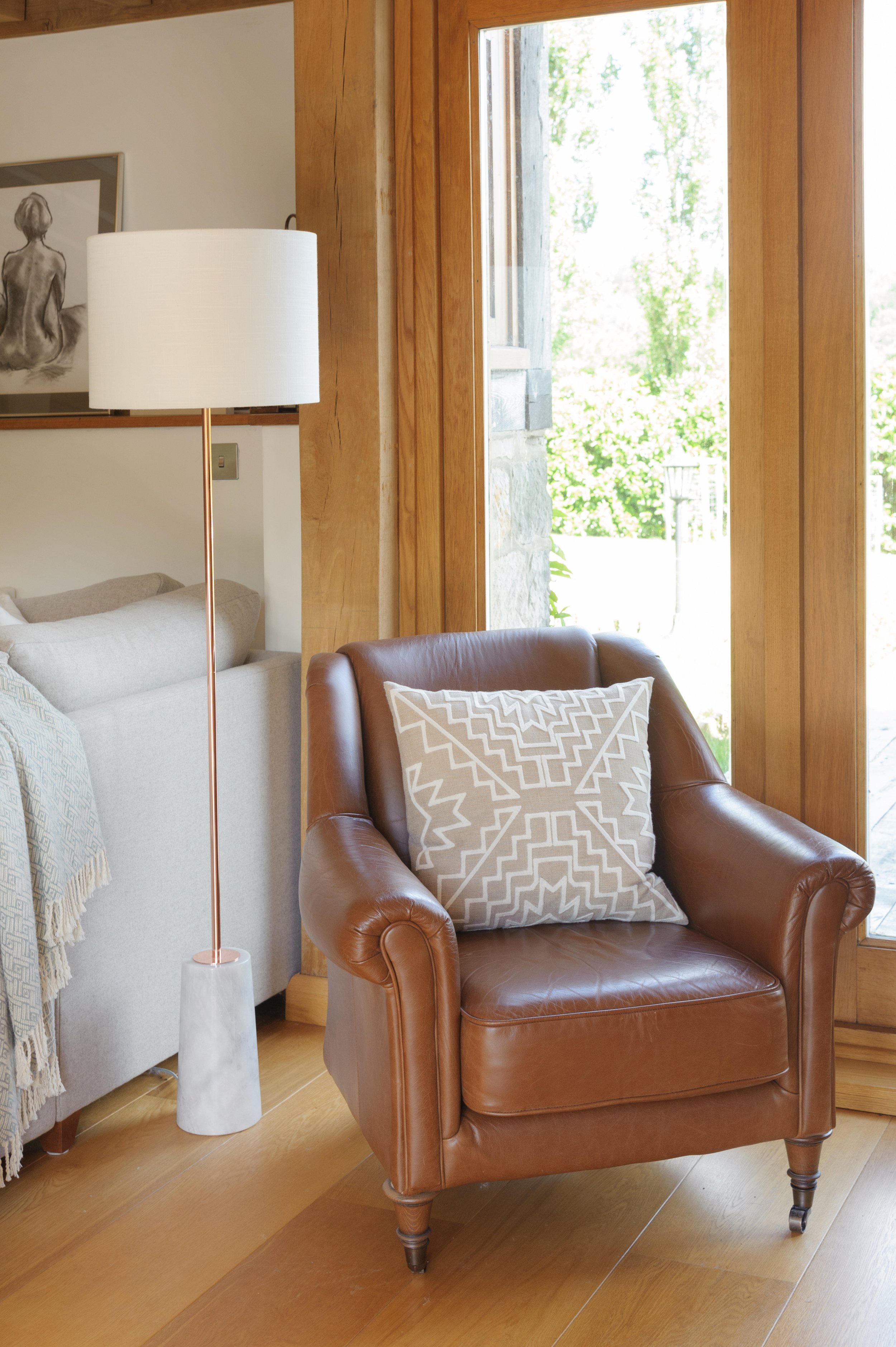
We used natural wools and lots of layering with rugs, cushions, buttoning and knitted finishes to blend with the oak beams and the textured stone walls. This enhanced the rustic feel, further emphasising the closeness to nature outside, allowing users of the space to feel connected to nature, whilst still enjoying the warmth of the wood burner and the cosiness of being indoors.
<img src="https://images.squarespace-cdn.com/content/v1/56d2dab43c44d801f475de62/1690353822662-KXBKOB1LJ23KUOLVLXYL/Barn+conversion+textured+stone+wall+.jpg" alt="Barn conversion textured stone wall .jpg" />

<img src="https://images.squarespace-cdn.com/content/v1/56d2dab43c44d801f475de62/1690353821196-R5QGPYVI5WOO471MH6VJ/barn+conversion+with+leather+chair.jpg" alt="barn conversion with leather chair.jpg" />

#block-yui_3_17_2_1_1690353405860_23503 .sqs-gallery-block-grid .sqs-gallery-design-grid { margin-right: -20px; }#block-yui_3_17_2_1_1690353405860_23503 .sqs-gallery-block-grid .sqs-gallery-design-grid-slide .margin-wrapper { margin-right: 20px; margin-bottom: 20px; }
#2 Indoor-outdoor natural flow
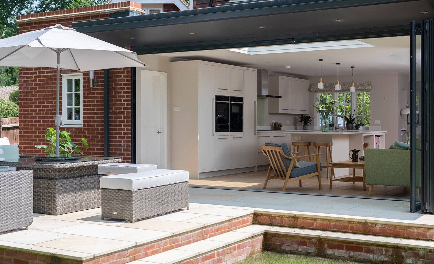
For this kitchen/diner/sitting room, the small extension helped open the existing spaces into one large space, whose bifold doors to the garden terrace truly opened up a seamless connection and natural flow to the outside.

Tying together contrasting styles
There is a gentle contrast in the design here, with the vintage, mid-century vibe in the corner seating area by the bi-fold doors offsetting the cool décor of the neutral, soft off white kitchen. The two differing styles are then tied together by the use of oak stools in the kitchen and natural materials in the seating area. This, in turn, provides the perfect neutral backdrop for the colourful cushions on the sofa and chair, and the pretty, organic, hand-block printed fabric blinds from Rapture and Wright

Biophilic design philosophy
When the bifold doors are completely open, anyone using the seating area will still feel as if they are outside, making this a comfortable and connected space to enjoy, whatever the weather, whatever the time of year. A perfect example of the biophilic design philosophy at work, which seeks to connect users and residents of buildings more closely with the natural world.

#3 Fun and functional
In this Georgian terraced house, the rear wall was removed and the kitchen extension rebuilt with glass screen doors, allowing the courtyard to be incorporated into the ground floor space.
Concrete connector
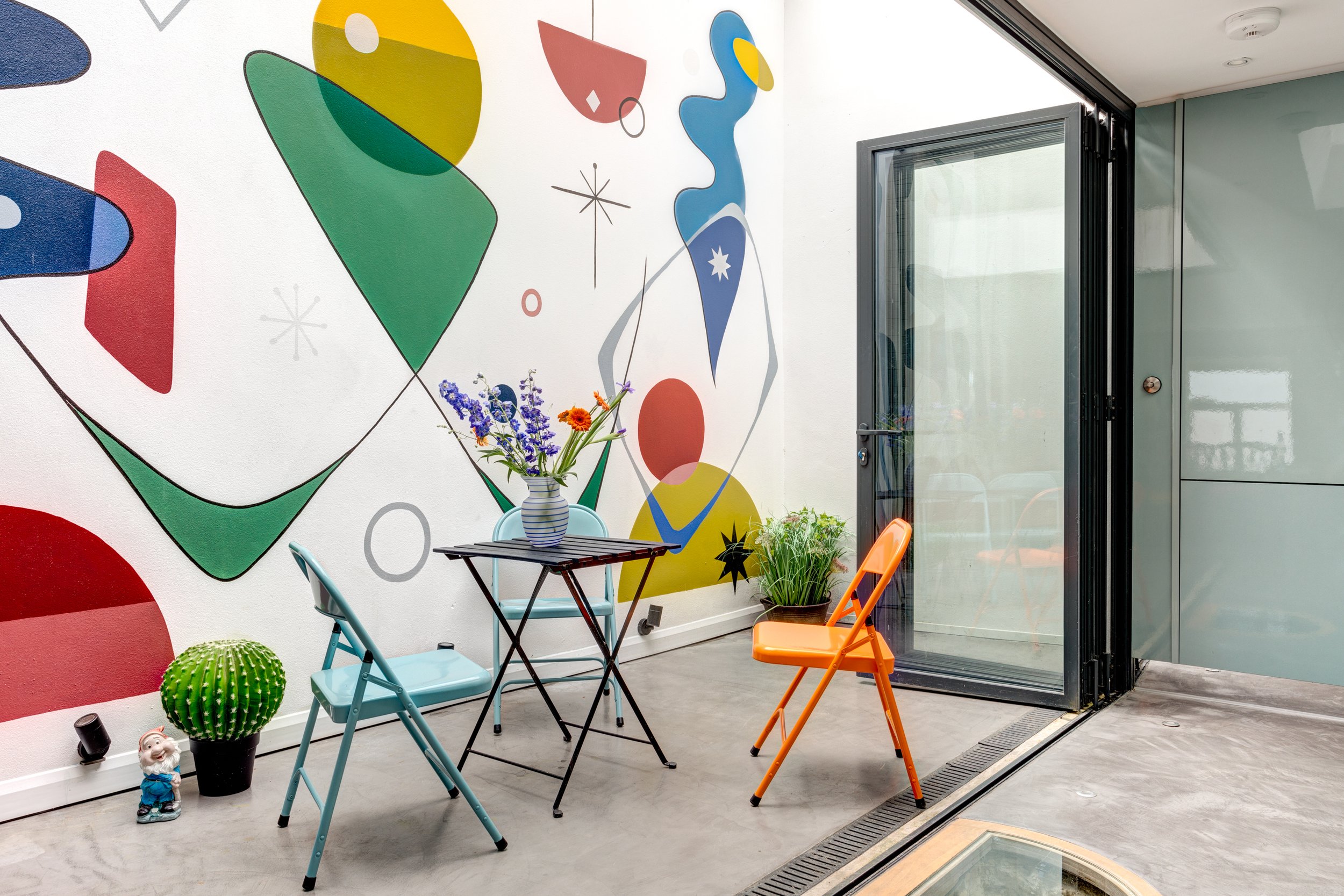
The polished concrete floor is the connector, allowing what was previously two separate areas to now appear as one continuous, multi-functioning space with ‘sunshine vibes’ in this tiny period inner city terraced cottage by the sea.

Colourful mural & ‘continental café’
The colourful mural on the newly-rendered courtyard wall is a cheerful inclusion that adds sparkle and lively fun to this period building. The ‘continental café’ feel is further enhanced by using colourful bistro-style chairs and table in a seating area perfect for lively and sociable friends and clients.

A touch of the unusual
Retaining one of several wells discovered during the foundation work provides an extra touch of the unusual. This was incorporated into the kitchen design and covered with a glass lid, as seen in the picture below.

Often overlooked, but all-important
Corners and ‘back ends’ of rooms may not seem particularly important in the grand scheme of things, but - particularly if they are the connector between house and garden - they must never be overlooked in a design project, and can occasionally be the most important thing.
So whether it’s a wood burner to provide some cosy warmth, or a ‘Continental’ corner to give a more cosmopolitan vibe, don’t forget to save some enthusiasm and attention for these often overlooked, but all-important spaces.
I love providing interior design direction for family homes, considering colour, furnishings, flooring and lighting, and family living, with indulgence, a little drama and plenty of personality. If you would like a hand creating your dream home or want a second opinion, give me a call at 07773 372 158, or send me an email via nicky@nickypercival.co.uk
I look forward to hearing from you.
Nicky