Updating a 1960s family home: a look at the highlights
The Brief
This project, updating a 1960’s family home was significantly delayed by the COVID lockdowns, but when things opened up again, we revisited our ideas and were able to come at it refreshed.
The project brief was wide-ranging. The 1960s house had recently had new windows and a new log burner in the sitting room, but the rest of the interior décor required updating throughout. The family had been living in the house for six years, the children were growing up, and the remodel needed to reflect changing needs of the family members.
Although some parts of the house required more attention than others, I put together my digital mood boards knowing that there was a need for a new design direction, fresh colour schemes and general interior decoration throughout.
Sitting-room for six
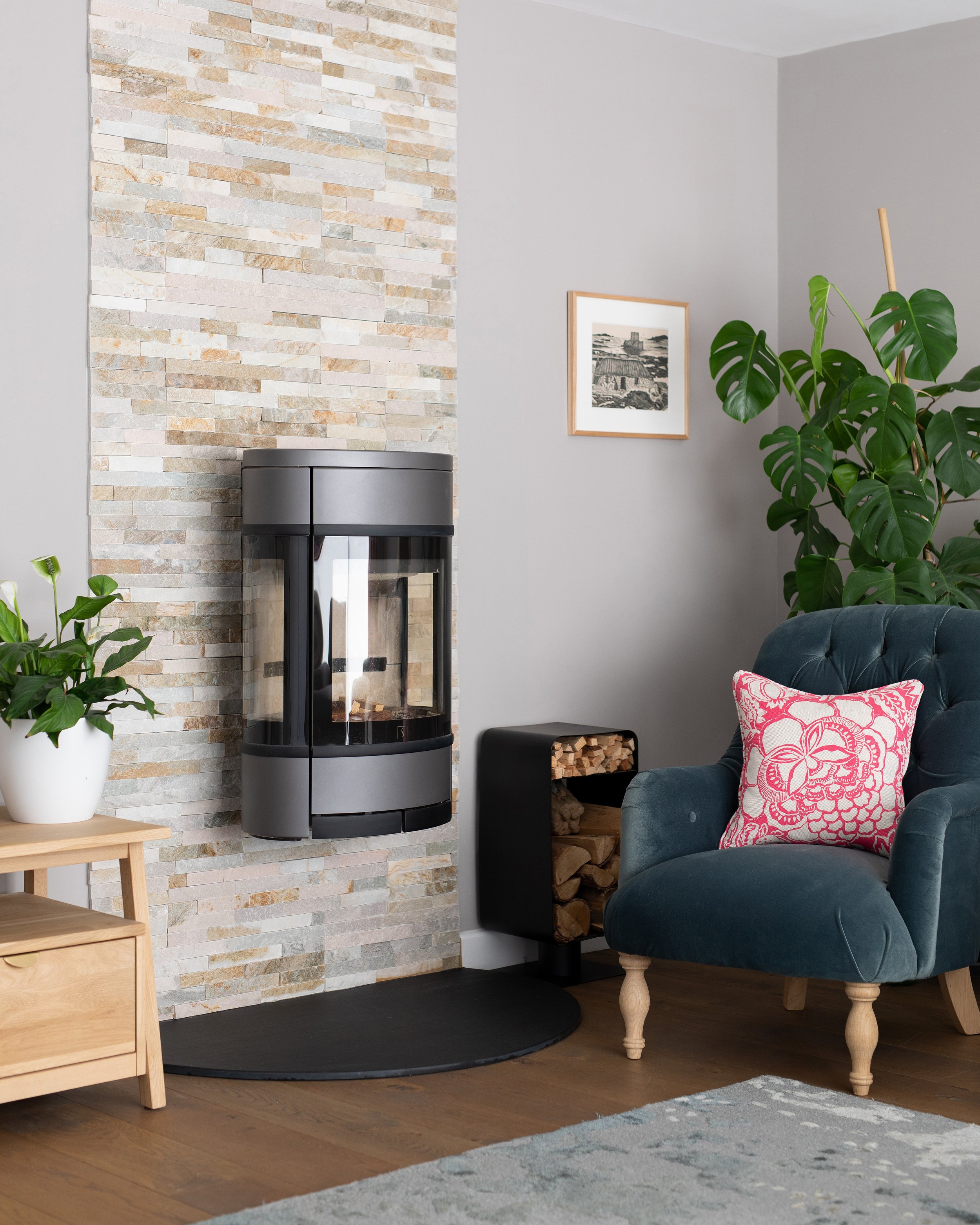
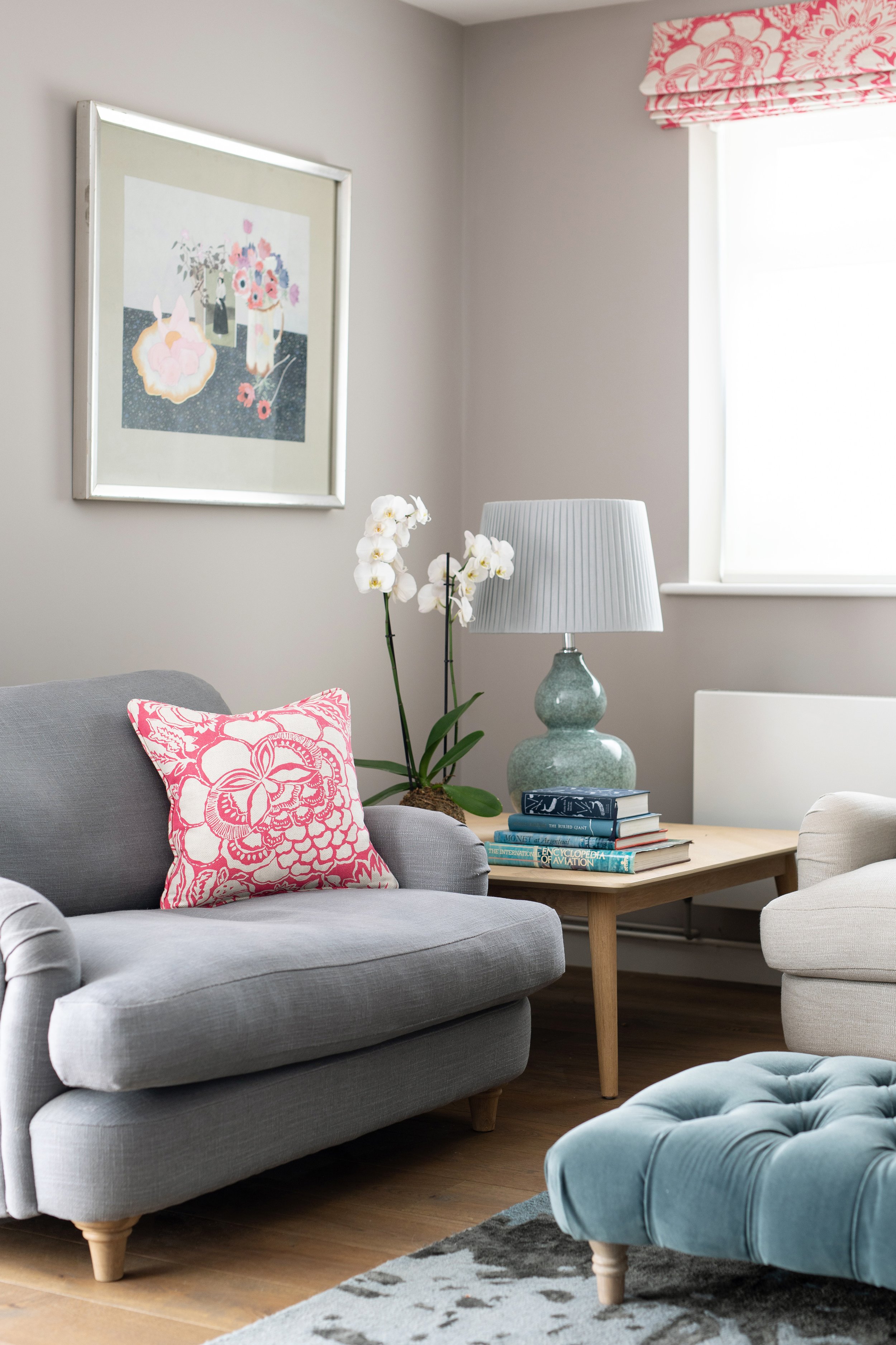
We went for a new colour scheme here, to better flow with the red coming out of the kitchen, and the more neutral soft pink in the dining room. The choice of Sanderson’s pink floral for window dressing was a bit of a risky suggestion, but the clients loved its fresh bright graphic style which suited the house. The layout of the room had been re-oriented around the new log burner. We re-housed the TV and added new furniture, to better accommodate seating for six people.
Statement hall, stairs & landing

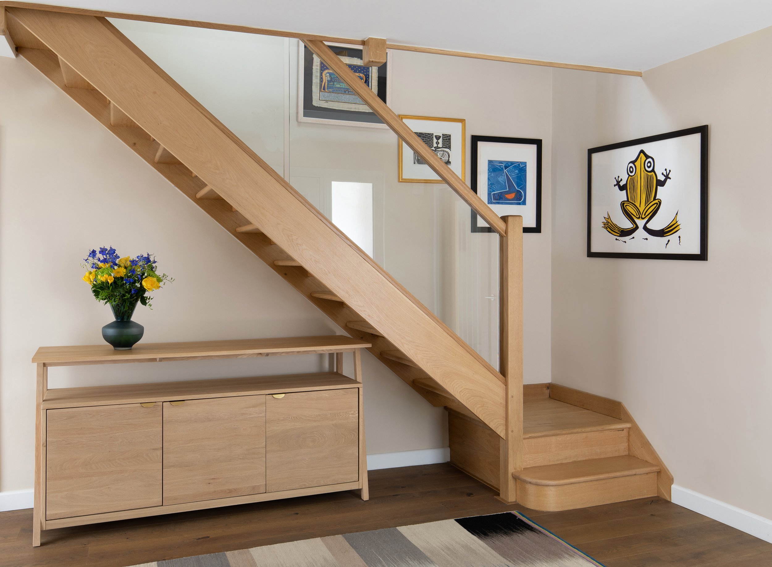
Above are the digital mood boards we used as a basis for the redesign of the hall, stairs and landing. There was much to do here, as both the flooring and the ceiling lighting needed changing. The stairs also needed a complete rethink, with the 1960s ‘open tread’ design with wooden bannister crying out for a contemporary update. We decided on glass for the new banister and used the wall space as a gallery area to display some of the clients’ art collection. The finished result is pictured below.
Blending space and finishing details in the dining room, kitchen & utility room
Having put new oak flooring throughout the ground floor, we opted for a new walnut dining table and chairs to contrast. There is also a seating end to this room (not pictured) with a fabulous relationship with the mature gardens accessed by large glazed sliding doors. The kitchen has accents of pink in the glass splashback and brick feature archway – so choices for the dining room were determined by these.

Maximising space in the study
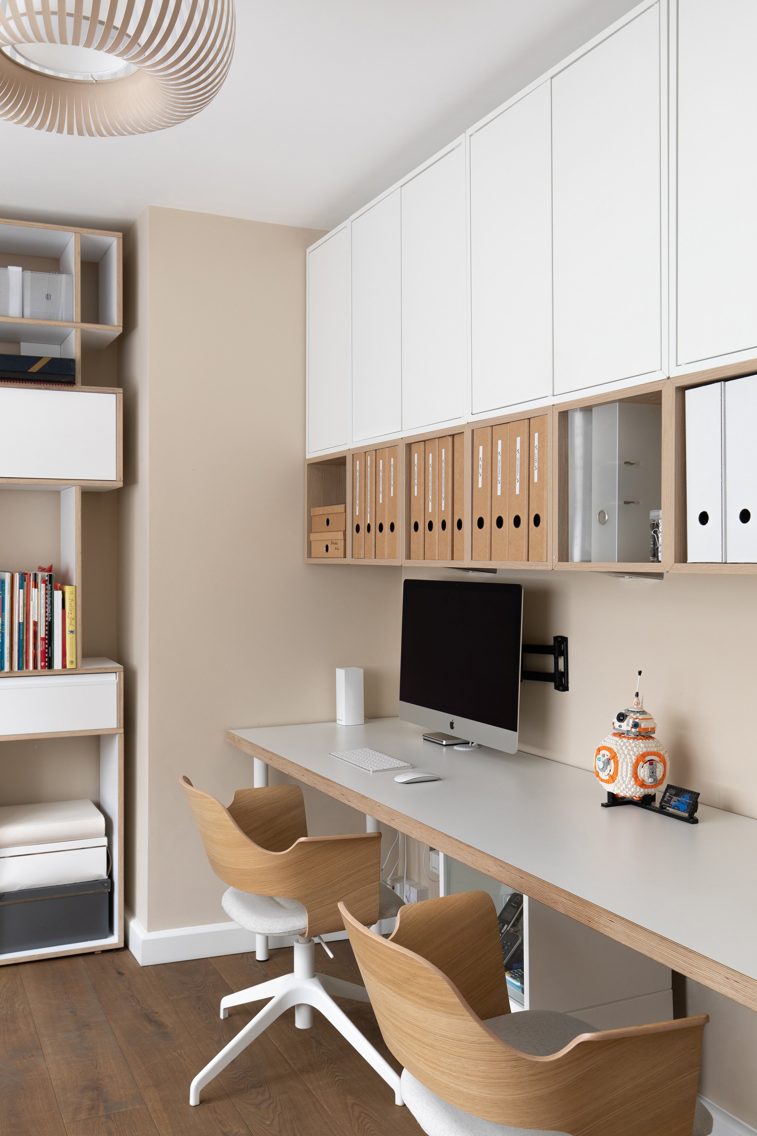
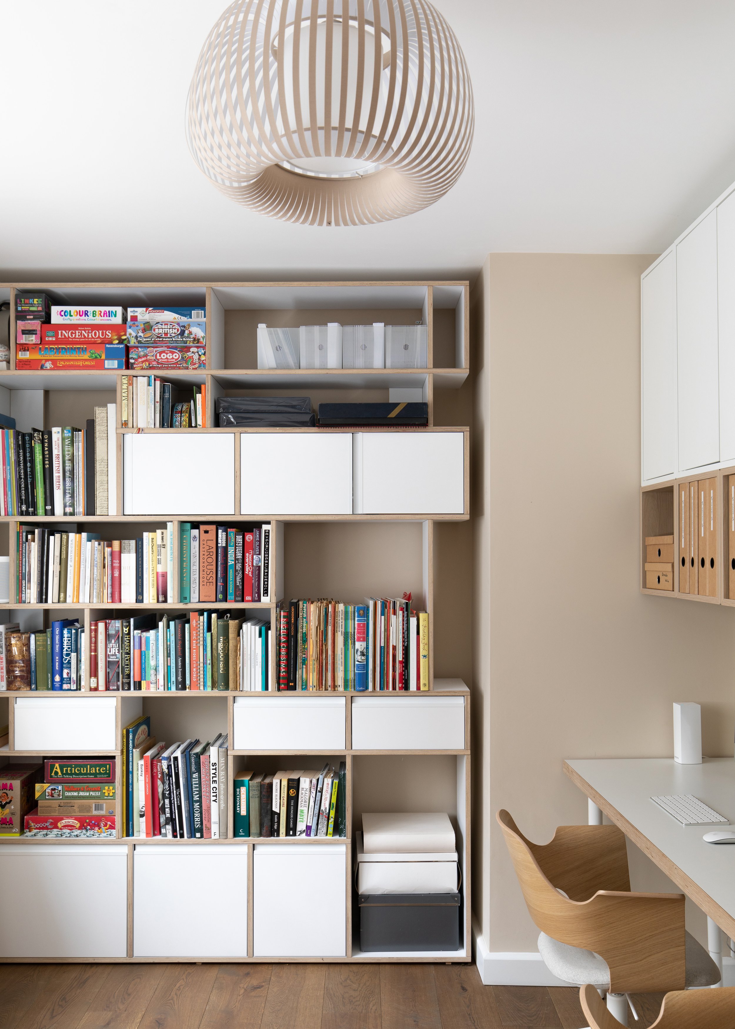
We approached the redesign for this room knowing that it needed to be a workspace for two teenagers studying for their GCSEs and A-levels. Although the room was already in use for some work and X-box gaming, the space clearly wasn’t being utilised to its best advantage, and there was plenty of room for improvement. A fresh look at storage solutions and built-in shelving enabled us to use the space within the room more efficiently and create space for the adults to be able to work there too, if necessary. We splashed out on a made-to-measure ‘Tylko’ shelving unit in the recessed end wall and saved on budget by using the formidable choice of wall storage from ‘Ikea’.
Creating a statement in the master bedroom

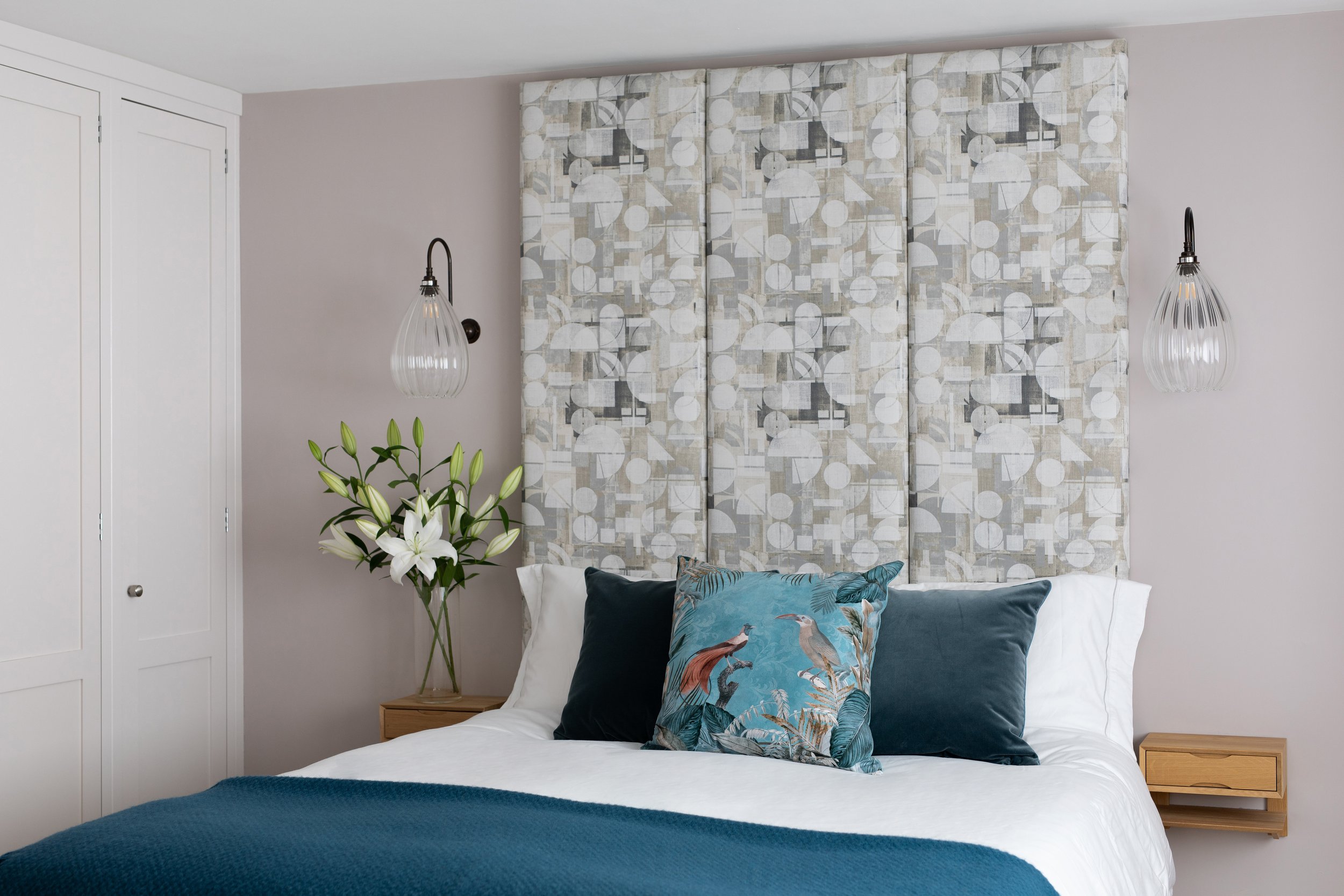
This room required complete redecoration. I created a mood board (pictured above) to give the clients a general overview of what I had in mind. We introduced new window dressings to match the proposed colour scheme. We designed and built a gorgeous new headboard for the bed, alongside new lighting and bedside tables, with attractive, understated doors for built-in storage. The headboard fabric is continued in the bench seat under the window with added storage drawers below
Remodelling the master en-suite

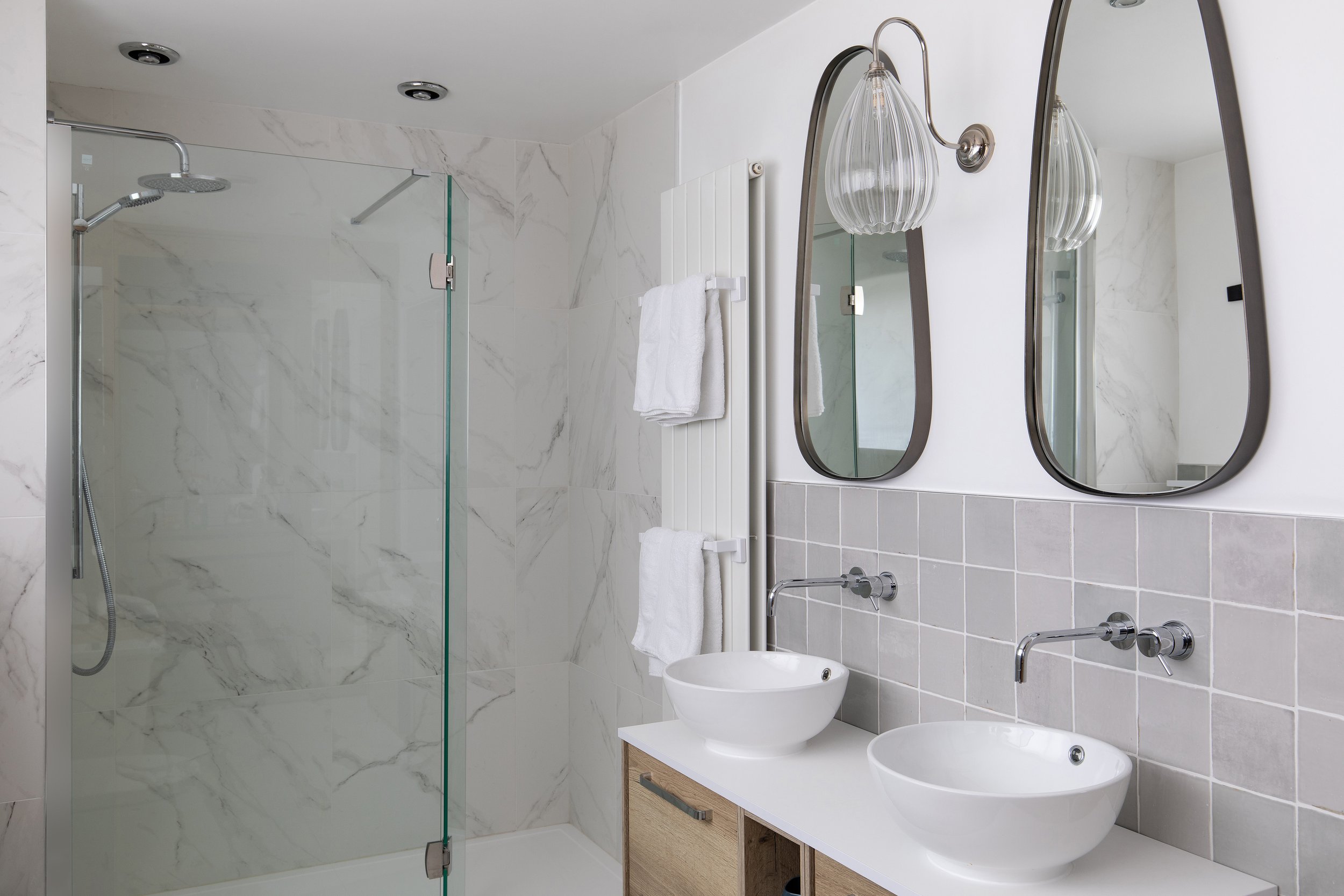
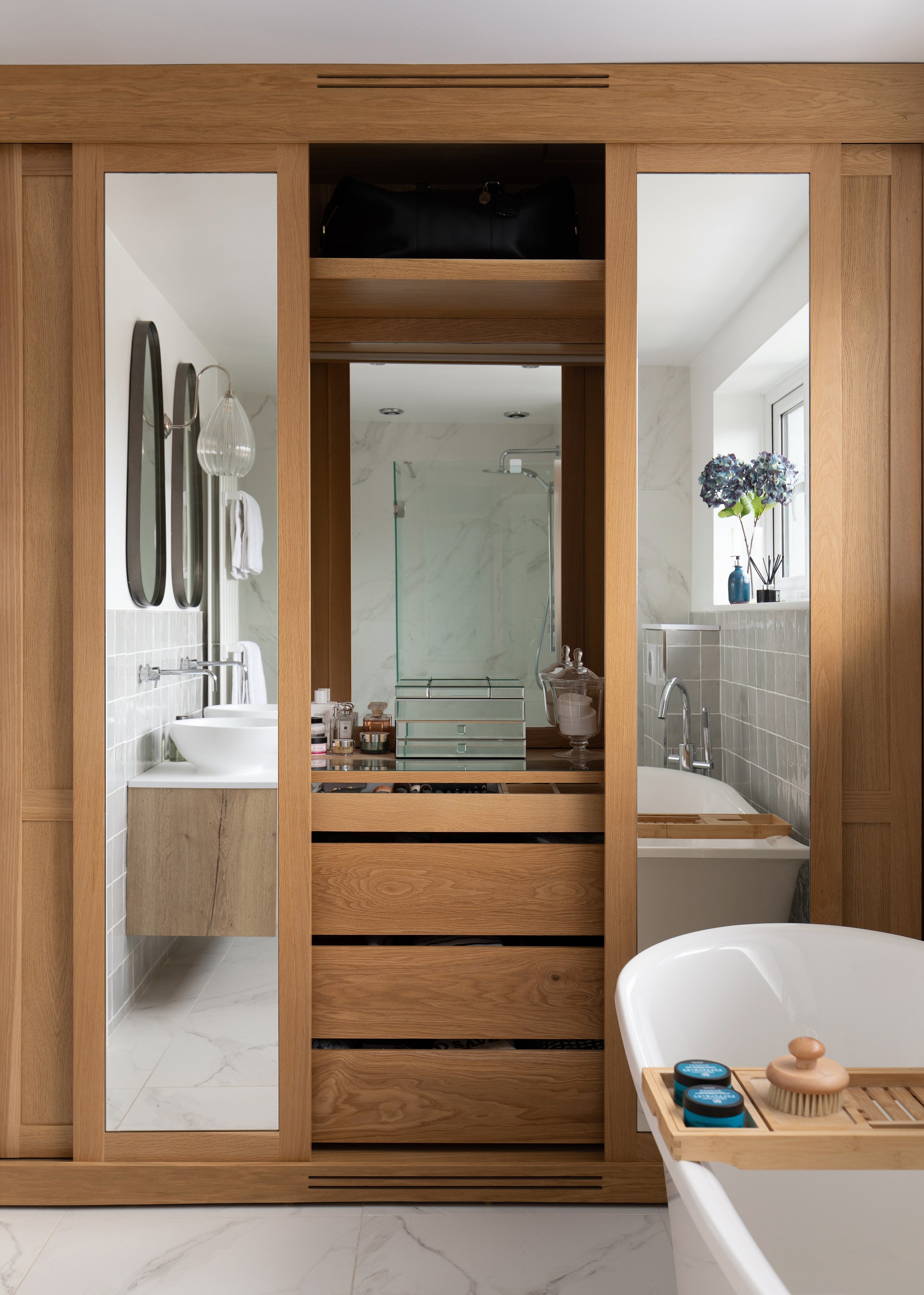
The en-suite was in need of complete remodelling, so we based our design on the mood board I had created (see above). The remodel needed to accommodate a walk-in shower, bath, two vanity basins and a new WC. Tastefully curved mirrors were introduced above the vanities, as well as new wall-mounted lighting to match that featured in the master bedroom. An oak and mirror-doored storage cabinet to house, dressing table, wardrobe and linen cupboard was created to maximise the function in this hard-working room
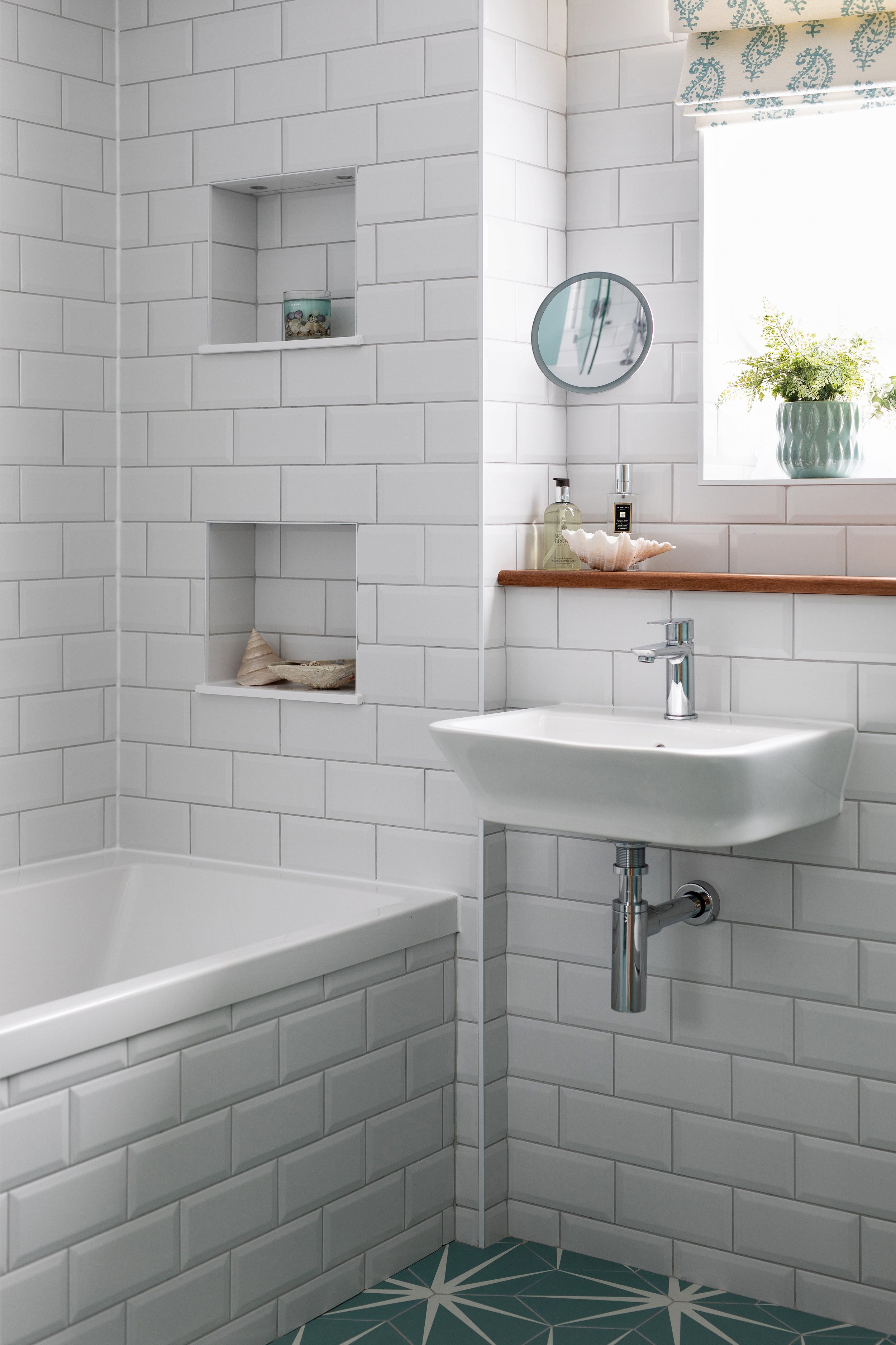
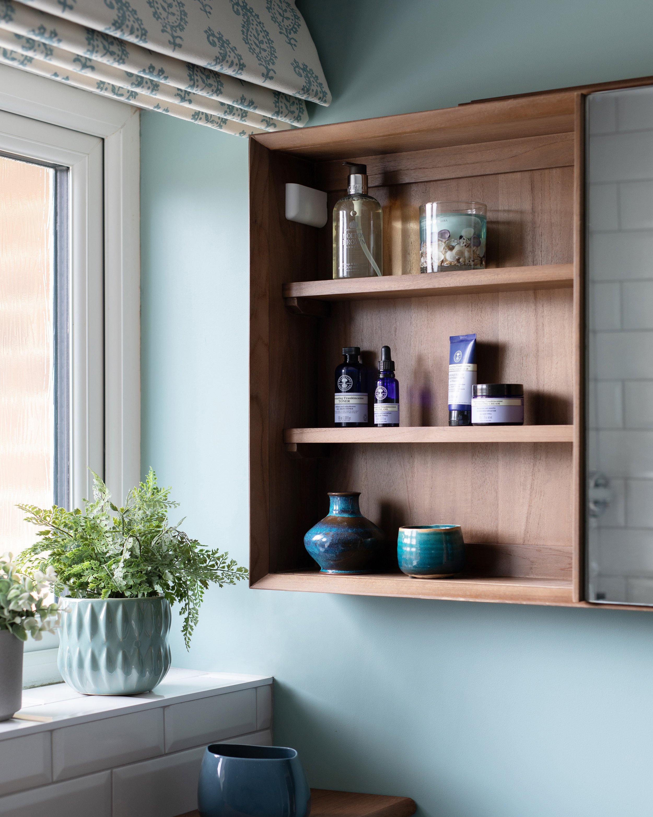
Modernising the family bathroom
Similarly to the master en-suite, the family bathroom also required a complete remodel, to make it more suitable for modern family living. The drawings gave us some idea of what our options were, in terms of the working space. Everything needed doing – bath, shower, basin, loo, tiling, storage and decoration. The soft blue on the wall gives the room a naturally calming, soothing atmosphere. The choice of ‘Ca Pietra’ Lily pad floor tiles in turquoise took a while to decide on as everything else is super neutral. White metro tiles are warmed with details in iroko and teak, and shelves are covered in hanging plants.
Teenage boy’s room treated to statement wallpaper and lighting
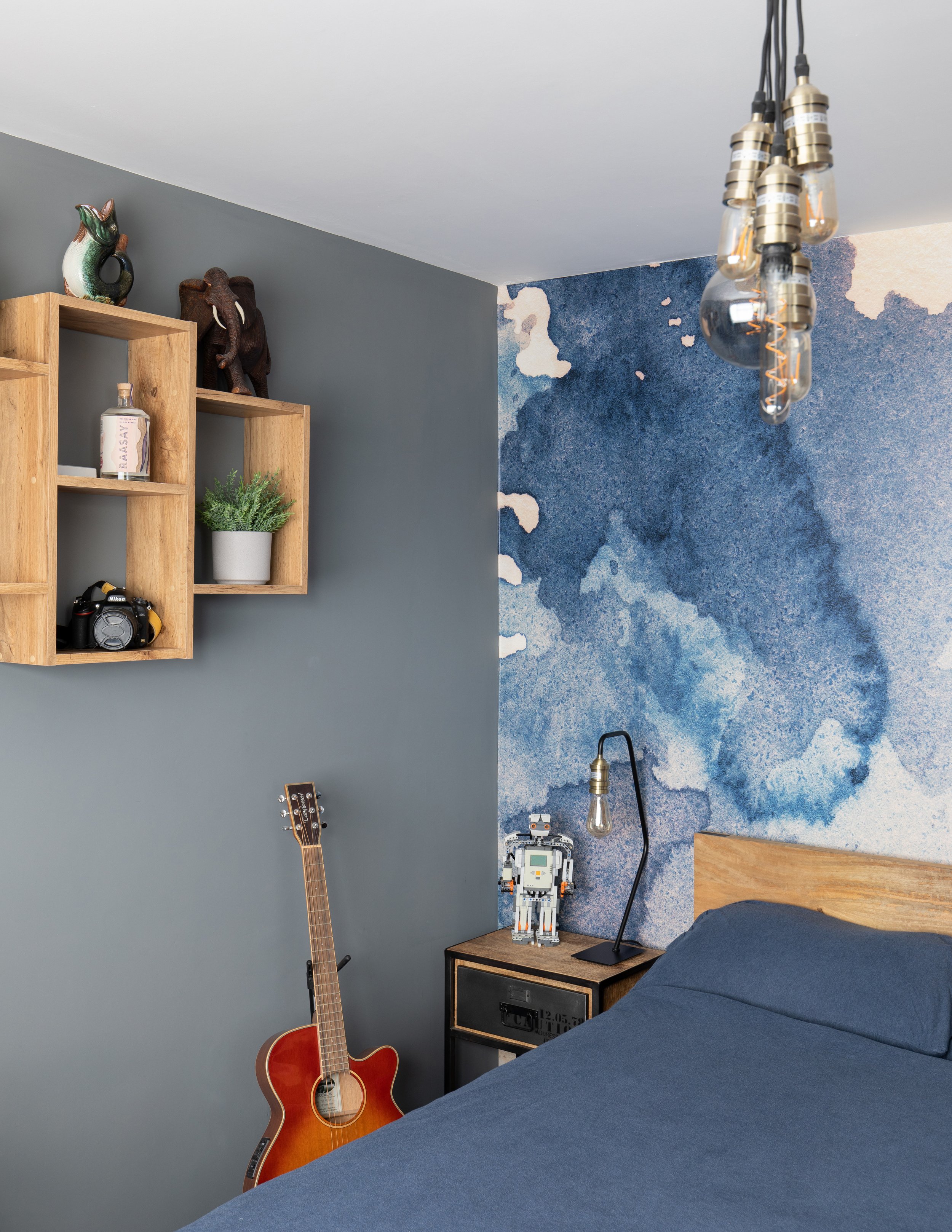
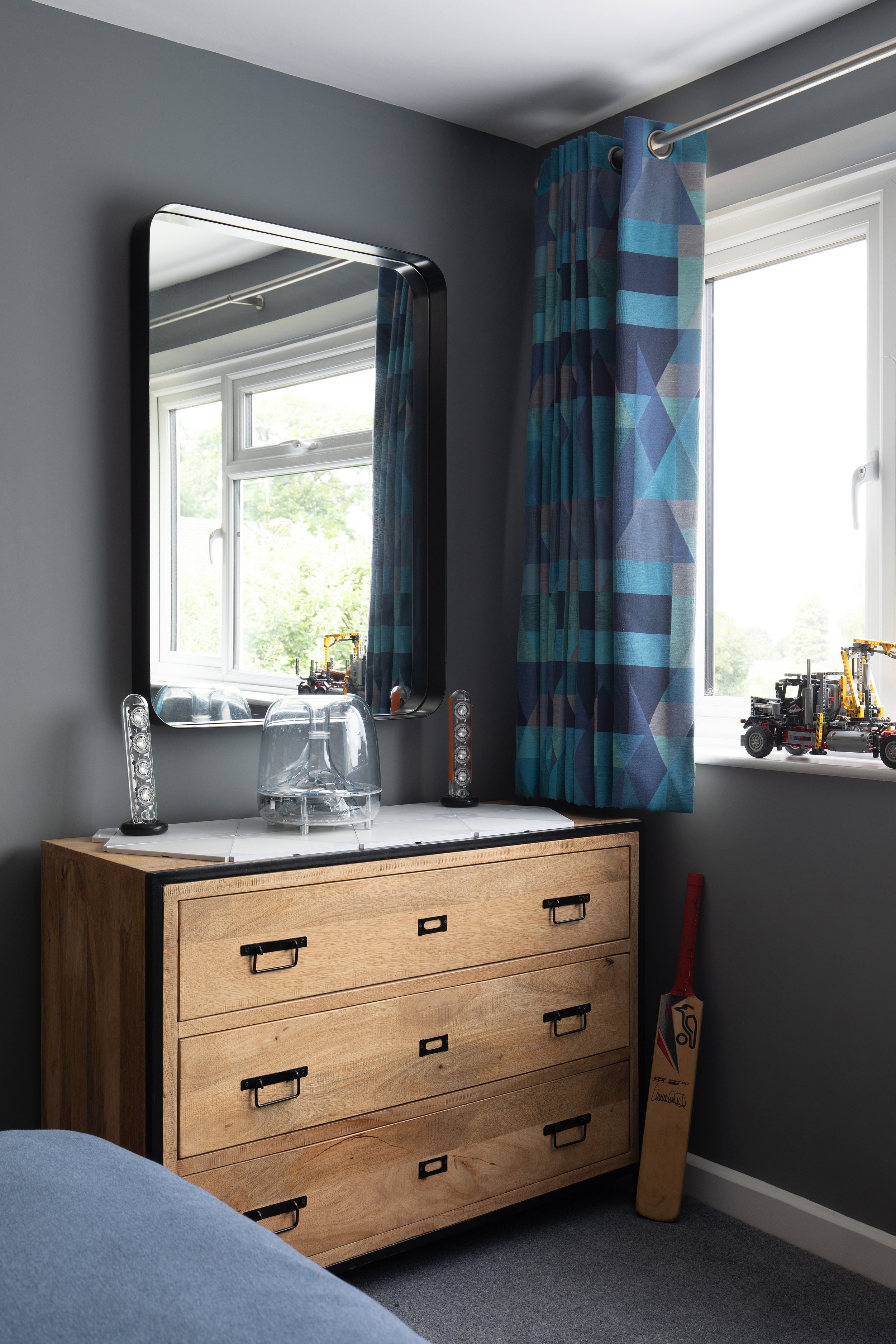
Originally, Matthew’s room wasn’t part of the brief. Although in need of redecoration and window dressings, on the whole, the room worked well, as did the furniture. But when he realised how much of an update the rest of the house was getting, he decided that his room needed doing too.
His room was the first room to be done and went very well although all the furniture we had specified was out of stock or no longer available by the time of ordering so had to be re-sourced in the summer of 2020. Rough-sawn wood with steel framed furniture lends a quiet industrial theme with exposed filament bulb ceiling fixture.
Stand-out features are the new overhead lighting and the funky ink blot mural from Rebel Walls behind his bed.
Teenage daughter’s spare room
Cary’s had her own ideas about how to redesign her room. She wanted to stamp her own personality on the space and went her own way.
Final reflections
Despite everything having been put on hold due to the lockdowns, in the end, we were able to agree on a style for the overall interior design and source the materials we needed. The project was completed to everyone’s delight, and the clients were very happy with their comfortable modern family home.
The client’s said
“Starting a home revamp at the start of the Pandemic was never going to be easy, and one which we would never have achieved so successfully (or at all!) without Nicky. Working with clients with little design experience, Nicky took time to understand how our busy family home functions and what we wanted to achieve from the process. Nicky worked with us to develop our 'vague ideas', often introducing new ones which took us out of our comfort zone, but which proved to be spot on and which we are delighted with! Nicky was a massive help sourcing and recommending materials, beautiful lighting, hard and soft furnishings and was able to draw on the services of professional craftspeople to carry out work for us to a very high standard. Nicky was so approachable, responsive and genuinely enthusiastic about our project. She made such a difference! We are delighted with our new look family home and would thoroughly recommend Nicky.”
Client review first published Houzz
In the meantime, if you are looking for an interior designer in Kent who will listen to you and transform your home you are welcome to give me a call on 07773 372158 or send me an email at nicky@nickypercival.co.uk for a without obligation chat.
I look forward to hearing from you.
Nicky
For full project brief and design click here