Renovating and Extending a Listed Period Cottage - Part One
The Brief
This building is a period cottage that was once a stable and then garages with rooms above. It had been a holiday cottage located behind the main house. Plans for the redesign included a glazed extension to replace the triple garage, which would provide a two double-bedroomed home for the children’s grandparents, complete with a lift and new internal fittings.
We wanted the two aspects of the property to blend seamlessly into one another, but without the cottage losing any of its original period charms. As the extension was to contain entirely new fixtures and fittings, the cottage would also require a complete overhaul of its interior design, including new windows.
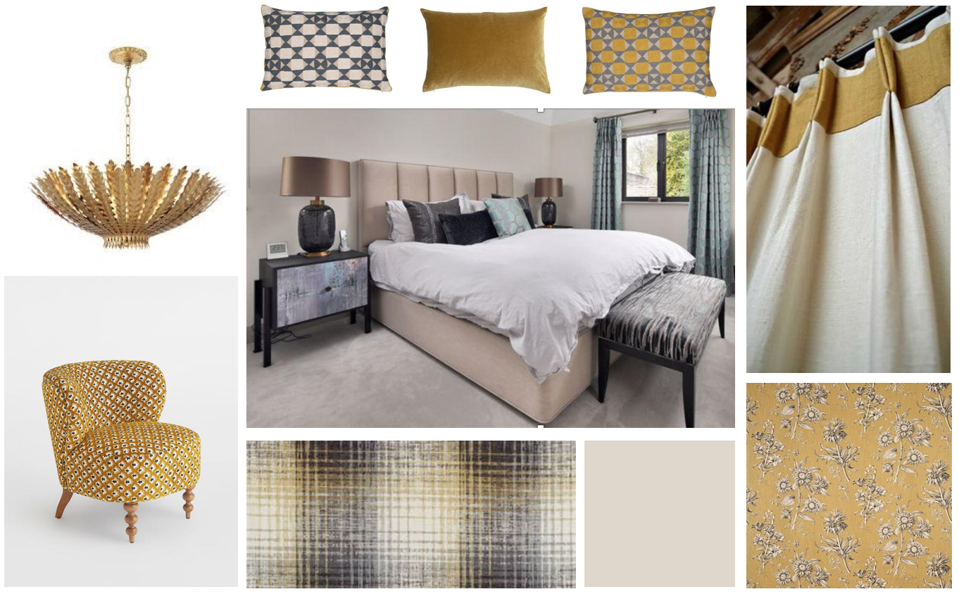
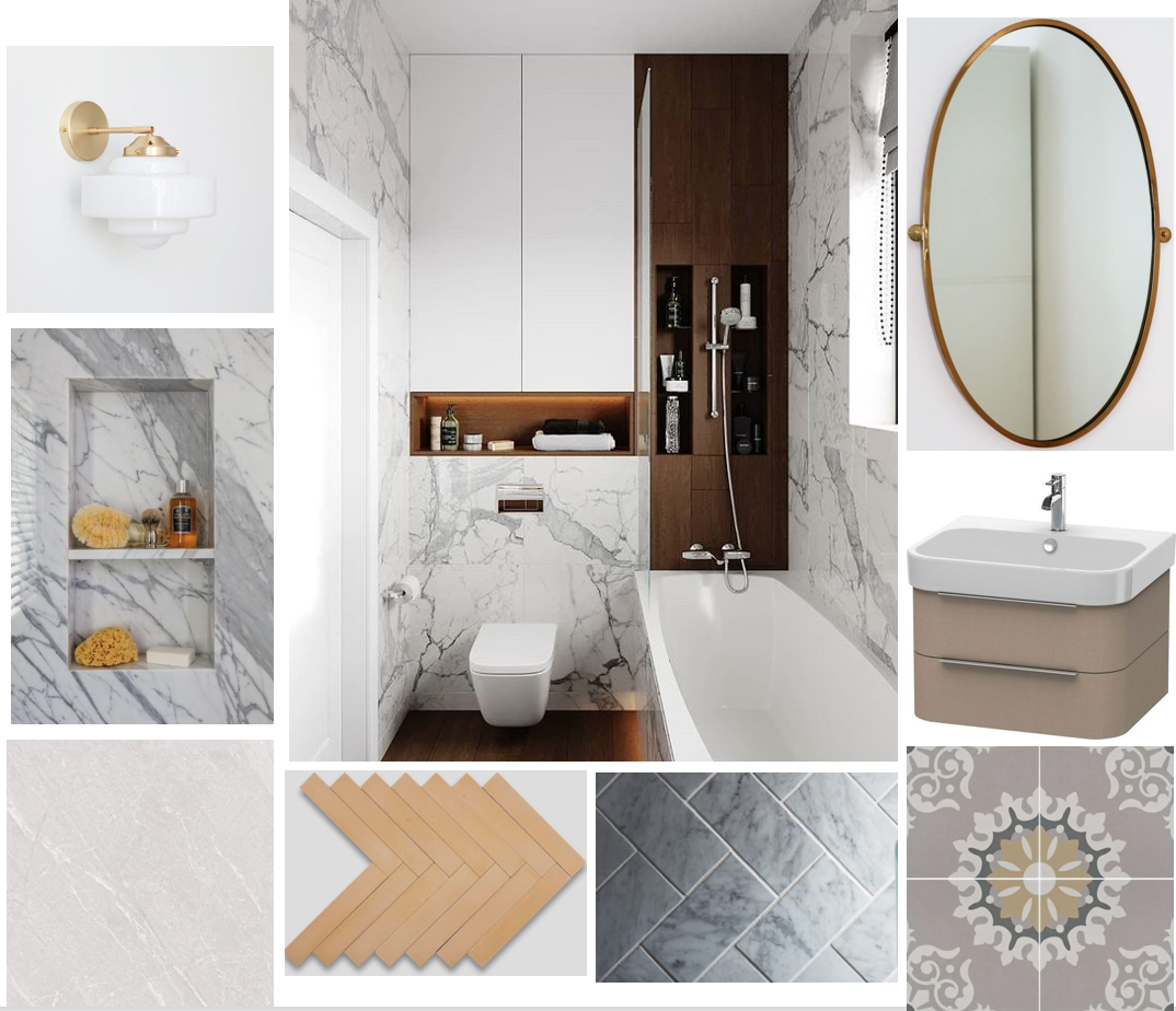
In this first of two blogs on this project, we will look at the ideas for each room, and the digital mood boards I created to help guide my clients in choosing a direction for the redesign.
In the second blog, (Part Two), we will cover how we mixed the period cottage and modern spaces, and look closely at the styling, colours and furnishings chosen for each room.
Kitchen
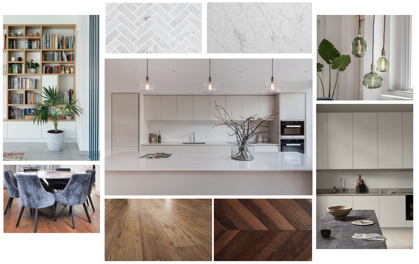
A central part of the cottage and a crucial area in terms of the main living space, this needed to be modern, practical, well-laid out and efficient in terms of its storage solutions. But as well as being fit for contemporary living, thought also had to be given to creating an aesthetic appropriate for a listed, period building. Although it would be renovated and fitted to modern standards, it was still, a period cottage. There were other considerations too. One was the need to create a utility space by the staircase in the hall, thereby keeping the laundry and associated white goods removed from the main kitchen and living space. The other was to keep in mind that the new layout would need to accommodate space for the new lift, which was to be fitted in the hallway/kitchen.
Sitting/dining-room
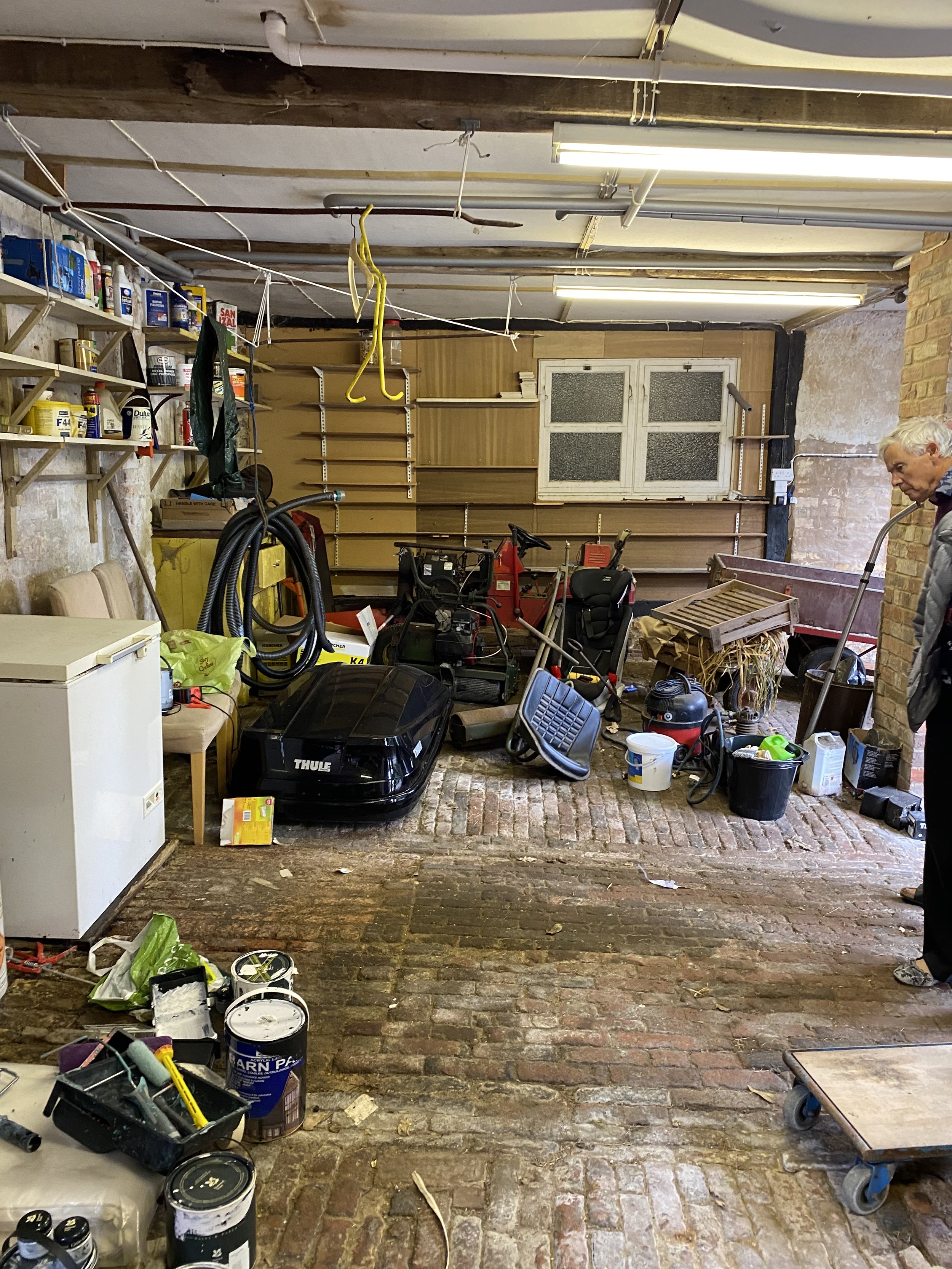
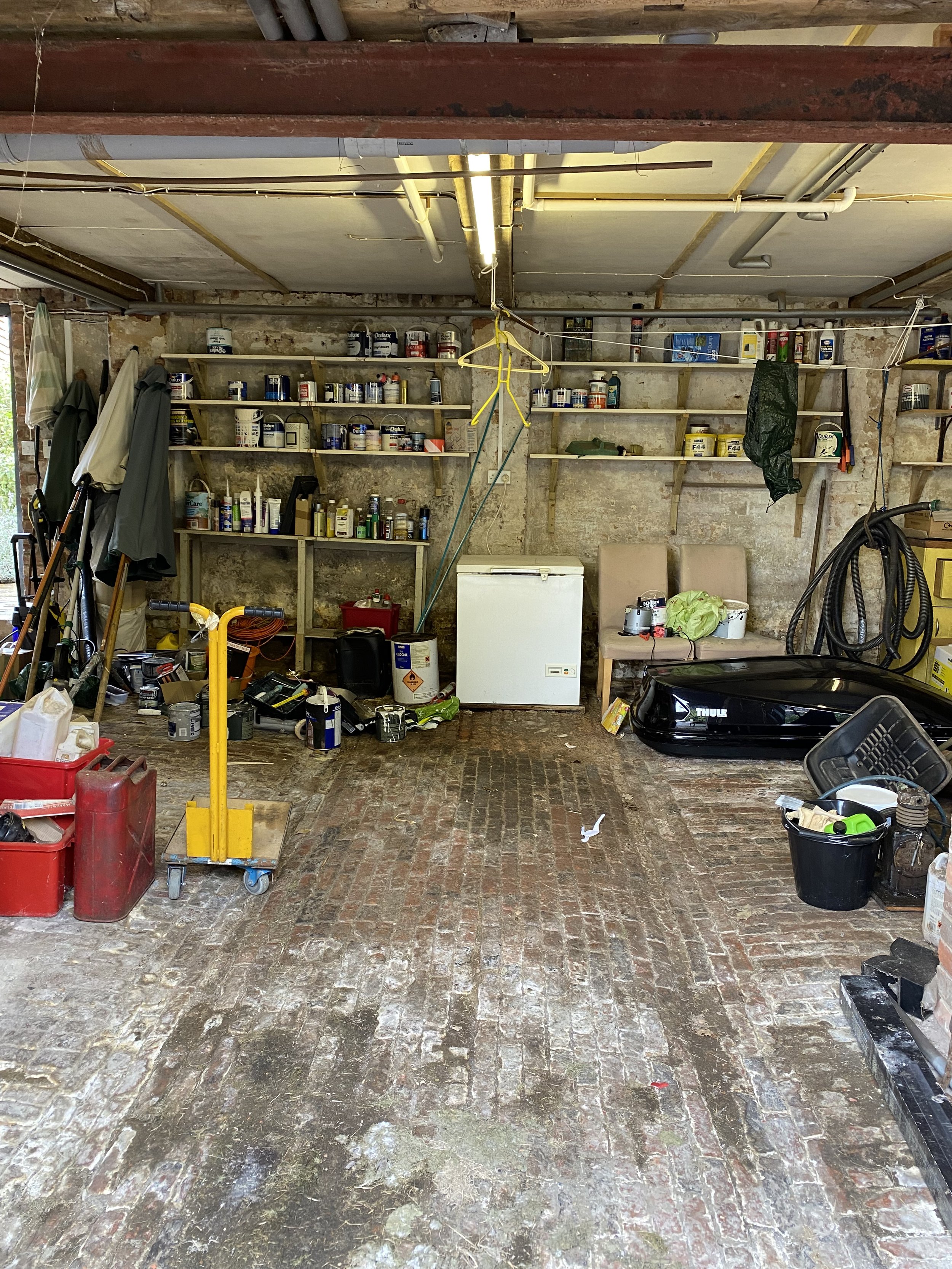
This was to be the feature room in the rebuild, replacing what was previously a triple garage, with the new bi-folding doors giving the family fabulous access to the garden and the view. The main considerations here were all about making the best use of space to go with the existing furniture, much of which was quite large and quite modern and the orientation of the light and the views. And with the relatively low ceiling, lighting was something we had to consider quite carefully. A hard floor with underfloor heating was also possible, with rugs providing extra warmth and cosiness.
Garden room

An entirely new room leading off the main kitchen/living/dining space, this was to be a single-story, glazed extension, pushing into the garden and taking full advantage of the views beyond. The furniture for this room was being brought from the previous house. It would need to blend with the rest of the downstairs living space but also fit with the orientation of the walls and windows, keeping in mind that the room would also house a newly built chimney to accommodate a TV and a fireplace.
Downstairs bedroom and bathroom
The original downstairs sitting room would become a guest room using existing furniture from the previous house, so the redesign would have to accommodate this and work around it.
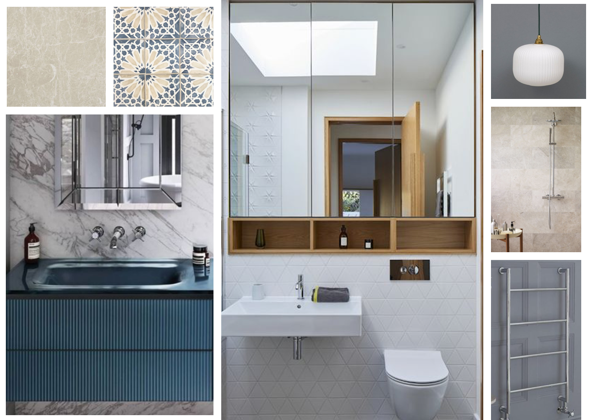
The bathroom had to be reorientated as the wc could not be moved, and we needed to replace the original bath, which went across the window, with a shower. Storage was a real concern for the client as she was moving from a much larger house, so bespoke joinery above the vanity was needed. We kept to a similar palette for both the bedroom and bathroom downstairs.
Upstairs bedroom and bathroom
Although the first floor of the cottage already had two bedrooms and a bathroom, these needed to be renovated and modernised, with a complete refit for the bathroom. We also had to re-orientate the space to accommodate the new lift and create a walk-in wardrobe space from what was previously a smaller, second bedroom. Again, there was existing bedroom furniture from the previous house that needed to be accommodated.
The bathroom overhaul involved considering lighting, cupboarding and a fully fitted bathroom with a large walk-in shower for ease of access.
In summary
We were looking at a new design direction for the entire cottage. The use of contemporary furniture in the period building provided the opportunity for a lovely juxtaposition of styles, but careful consideration had to be given to the aesthetics of the new bathrooms and kitchen to ensure that the flooring, lighting, fixtures and window dressings were suitable choices for the direction we had chosen. In Part Two, we will look at these choices and see how the rooms looked when they were finished.
In the meantime if you would like a hand creating your dream home or just want a second opinion, give me a call on 07773 372 158 or send me an email via nicky@nickypercival.co.uk