A Contemporary Refit For A Classic Design, Part 2
Progressing the project
In my previous blog, I explained how we renovated and redesigned the interior of a Decimus Burton house from the 19th century, updating it to make it suitable for modern living, whilst still recognising and respecting the building’s heritage. Our focus there was on the ground floor of the property. Here, we will look at how work progressed on the first floor.
The plan was to remodel the entire floor to create five bedrooms and three bathrooms, two of which would be ensuite. The clients also had planning permission to increase the size of the rooms at the front of the house by moving the landing/corridor back. This would now become a relatively dark space that needed to be well-lit and painted a light shade of off-white.
The floor plan seen below illustrates how we envisioned the remodelling taking shape.

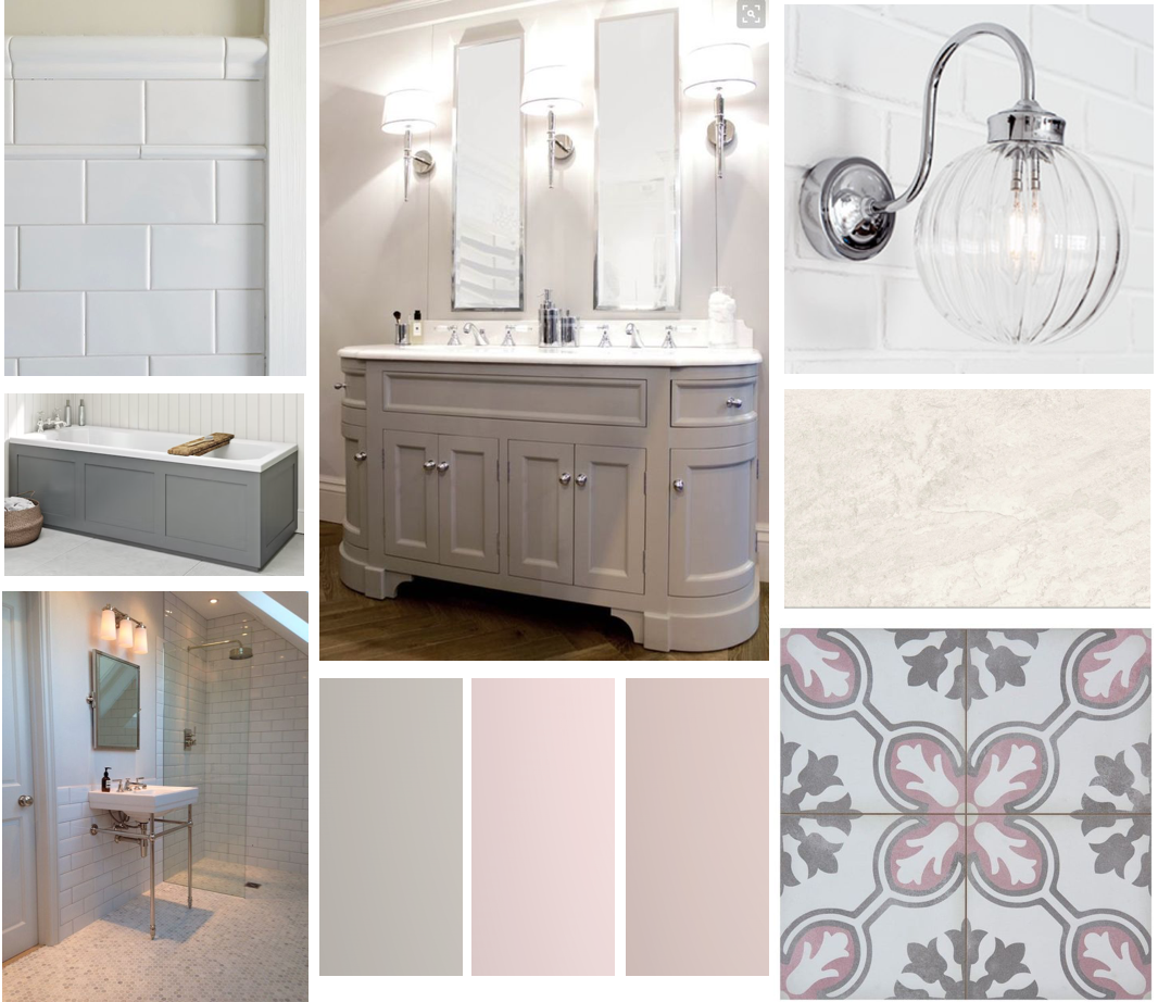
Family bathroom
This was to be shared by the family’s two young daughters and needed to be reconfigured to include a double vanity, a bath and a walk-in shower. Achieving this was a challenge due to the positioning of a chimney in a corner of the room.
Our colour scheme was based on a pink palette. The Pale Lilac by Mylandswent beautifully with the Carrera marble tiling in the shower and on the floor and the classic white metro wall tiles up to dado-rail height. The pink colour of the vanity was selected to match the pink on the walls.
The mood board below shows how the different shades and fittings would work together.
Two daughters’ rooms
The family’s daughters' rooms were variations on a theme. The older daughter preferred pink walls, with all accent items (furniture, lighting, bedding and curtains) in green or yellow. We selected Farrow & Ball’s Calamine to go with the Blue Mist curtains by Amara
The mood board below gives a good indication of the atmosphere we envisioned creating for the room.

The younger of the two preferred a green backdrop. Farrow & Ball’s Eddy provided this.
This time, we used pinks and blues as the accent colours. Both rooms featured a collection of vintage French-style antique furniture, with one of the rooms also containing a fireplace which could be restored as a feature.
Lighting and carpeting were required for both rooms. As with her sister’s room, the mood board was created in such a way as to convey both her tastes and her personality.

Guest bedroom
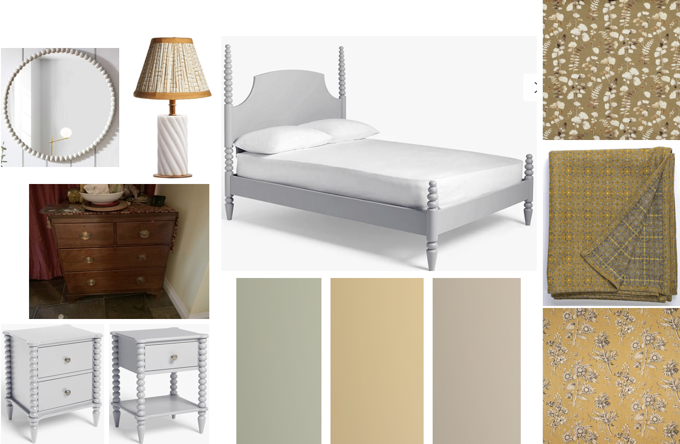
A north-facing room, so not the best in terms of lighting and natural warmth, but our plan was to offset this by using a warm and inviting colour scheme. I suggested a mix of organic and check designs for the curtains and upholstery in a warm, mustardy-yellow, and a Welsh blanket in the same colour to tie in with these.
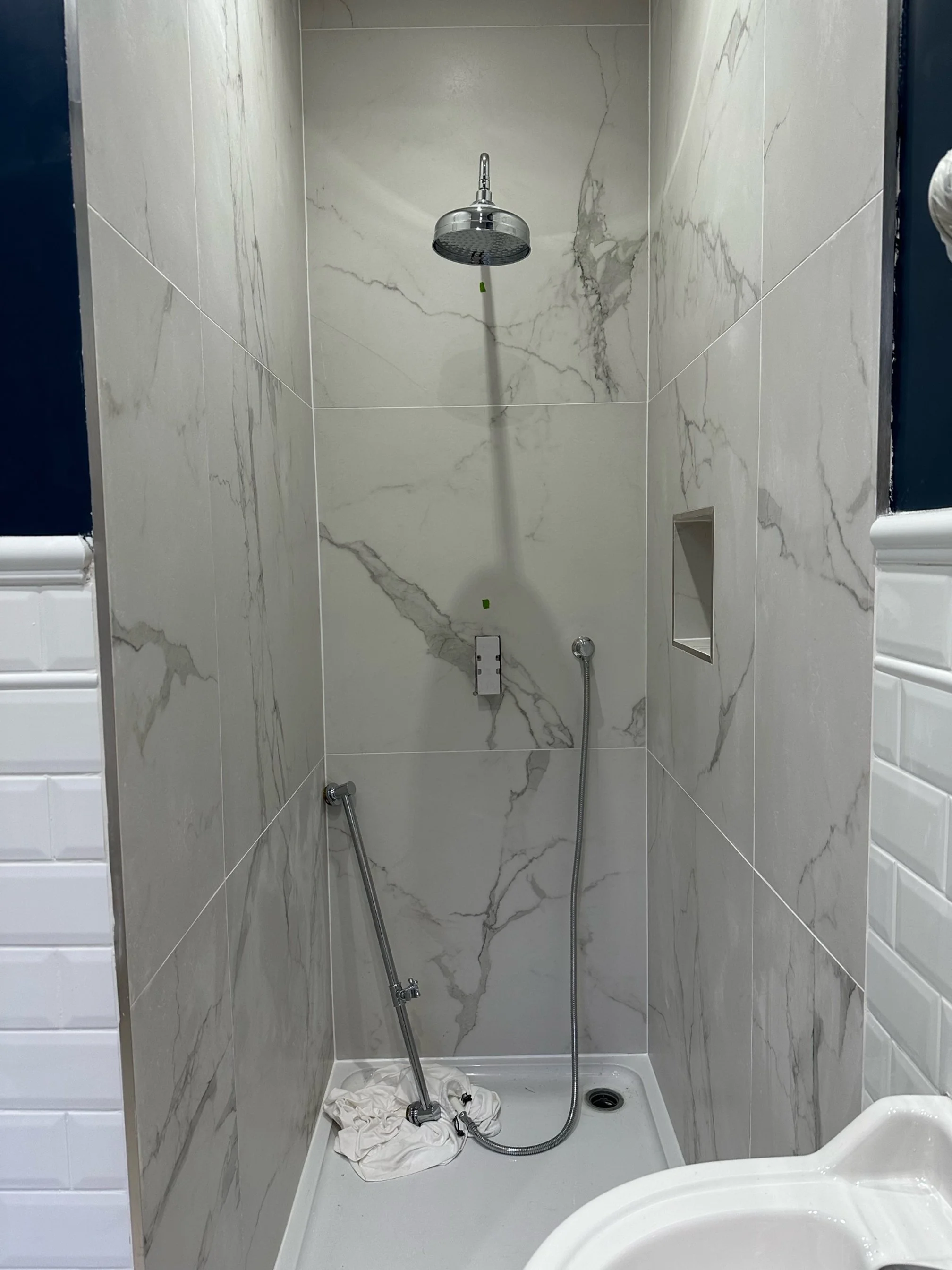
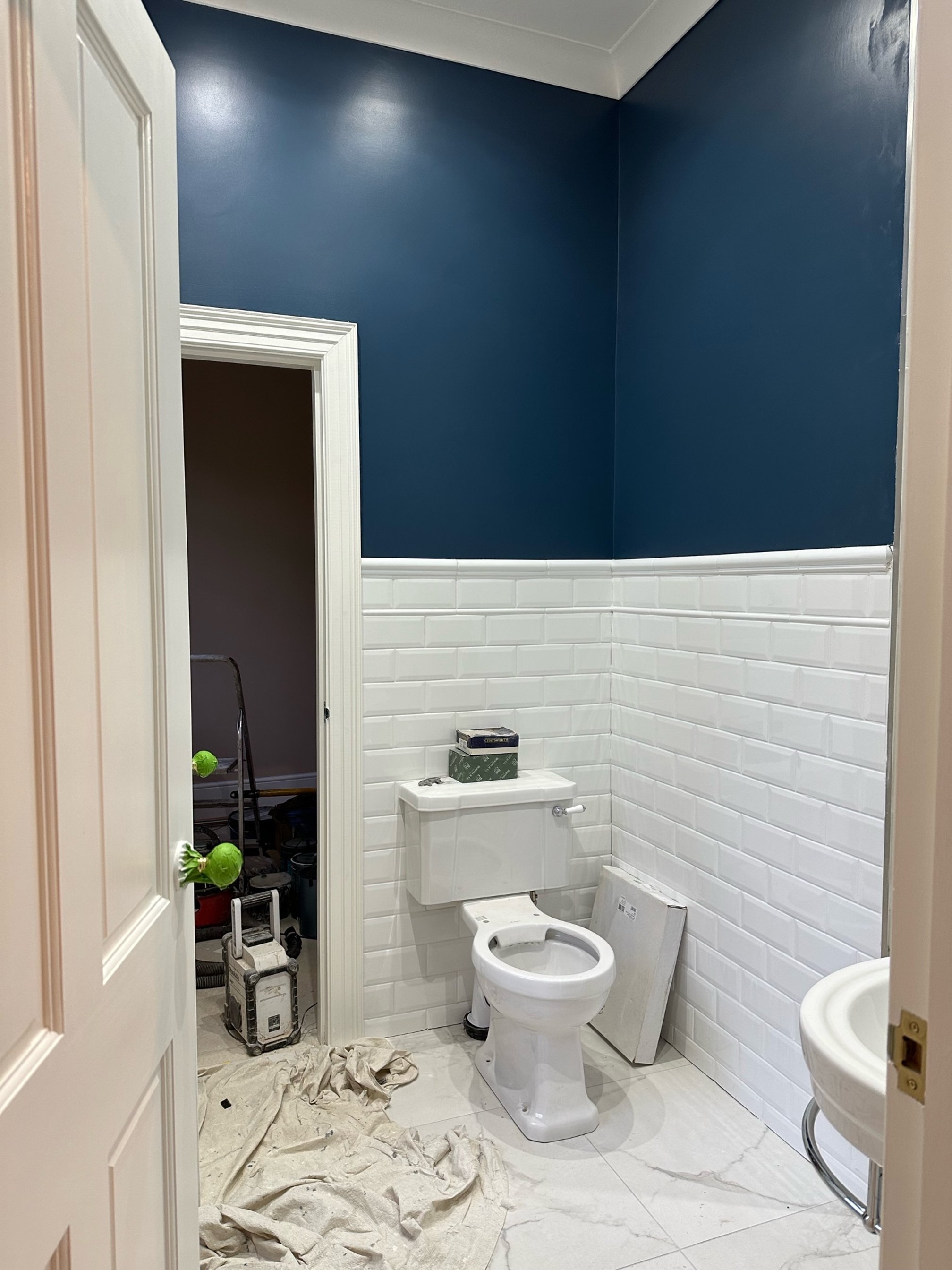
In terms of layout, the room would share a newly-fitted ‘Jack and Jill’ ensuite with the young son’s bedroom (a ‘Jack and Jill’ is a bathroom or ensuite which is shared by two bedrooms and is accessible from both), but we had to be careful to ensure that the colour palette was suitably complementary to both rooms.
<img src="https://images.squarespace-cdn.com/content/v1/56d2dab43c44d801f475de62/1701277895498-RG7EH62FLN67QANZLWRJ/Jack+and+Jill+shower+copy.jpeg" alt="Jack and Jill shower copy.jpeg" />
<img src="https://images.squarespace-cdn.com/content/v1/56d2dab43c44d801f475de62/1701277896299-WWS92SKAFWG5FLIPR2TN/Jack+and+Jill+b.room+copy.jpeg" alt="Jack and Jill b.room copy.jpeg" />
#block-yui_3_17_2_1_1701276969206_28451 .sqs-gallery-block-grid .sqs-gallery-design-grid { margin-right: -20px; }#block-yui_3_17_2_1_1701276969206_28451 .sqs-gallery-block-grid .sqs-gallery-design-grid-slide .margin-wrapper { margin-right: 20px; margin-bottom: 20px; }
We also had to be clever with storage, as the laundry would be situated in a cupboard accessed from the landing, and there also had to be room to store an ironing board.
New lighting, window dressing and wardrobes were also required. The mood board below shows what I had in mind for furniture and fittings in this bedroom.
Master bedroom & ensuite
This was a bright, south-facing, double-aspect room. But with the existing wardrobes having been fitted along the long wall down one side of the room, this had left the bed stuck between the doors to the room and the ensuite, giving the room a cramped feel, with insufficient room for a super-king sized bed and bedside tables. After much discussion with the clients, we decided that the best solution here would be to swap the positioning of the bed and the wardrobes. This would open up the view to the garden and allow the new wardrobes to act as a buffer between the sleeping and bathing areas.
The redesign would need to encompass new soft furnishings, a footstool, new window dressings and door furniture. We were looking at a soft, greyish-blue colour scheme with delicate patterns for added nuance. The pale wood cabinetry would blend nicely with this, as would the soft grey colour of the new wardrobes. The mood board seen below illustrates how I envisioned bringing these ideas to life.

In the ensuite, we introduced double mirrors above the vanity and new wall lighting. We painted the tiling to match the blue walls and updated the existing shower cubicle to incorporate a walk-in, wet-room-style shower. Below is a picture of how the finished bathroom looked.

Young boy’s room
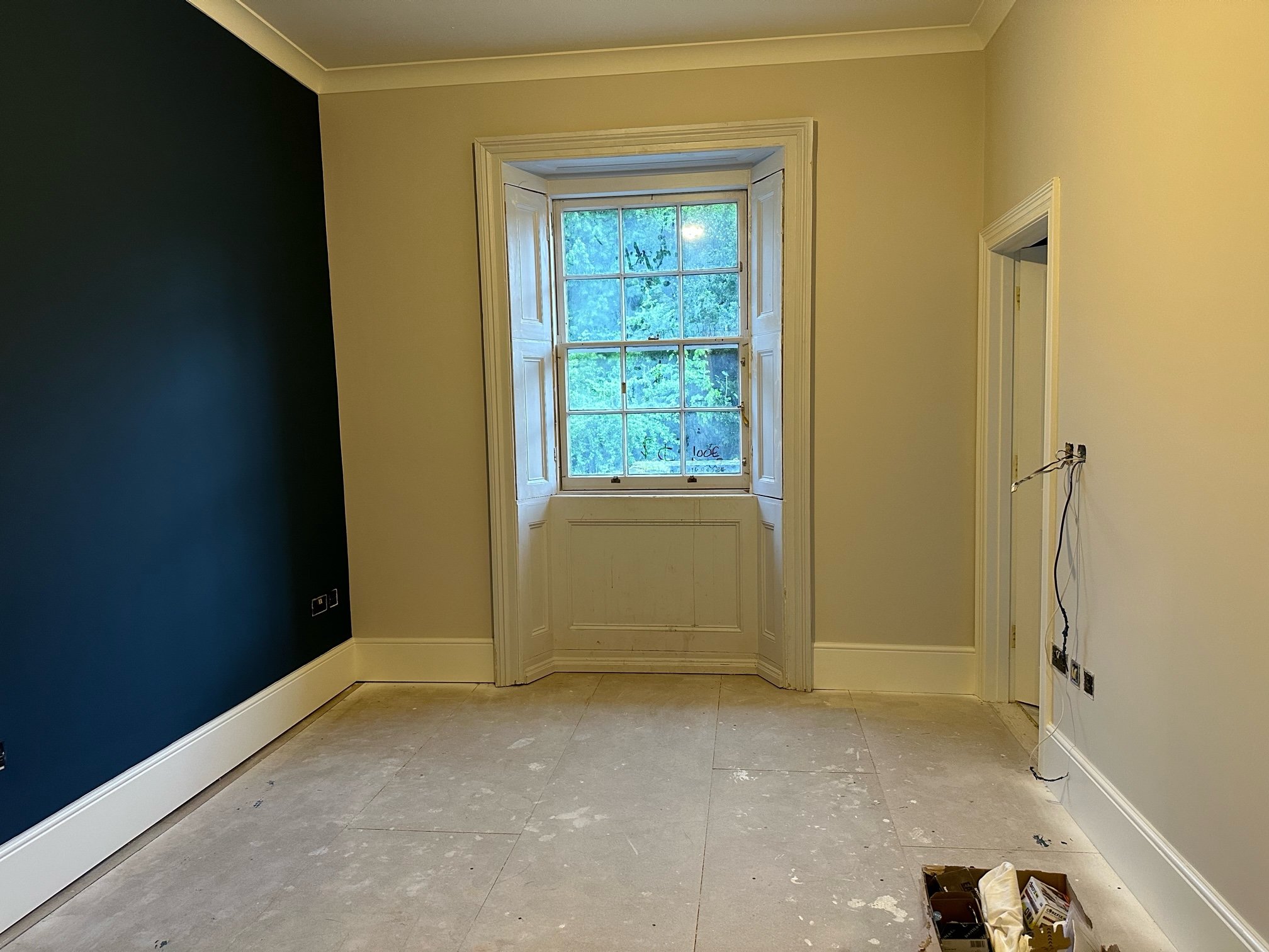
When designing the décor for a young child’s room, it’s always worth considering that the child’s tastes will develop as he/she grows, and there has to be space in the design to accommodate this. A good way to do this is by keeping the palette relatively neutral whilst introducing colour and personality through the use of removable and interchangeable items such as posters, pictures and soft furnishings. Bearing this in mind, we chose Farrow & Ball’s Skimming Stone as the main colour for the walls, with F&B’s Stiffkey Blue used on one wall as an accent to offset this.
Conclusion
As with the downstairs of the property, there was always a balance between modernising the interior to make it suitable for all the vagaries of contemporary family life, whilst also respecting a classic 19th-century design. To retain the look and atmosphere of its original design, whilst also ensuring that it could also be a warm, inviting and attractive family home.
I love providing interior design direction for family homes, considering colour, furnishings, flooring and lighting, and family living, with indulgence, a little drama and plenty of personality.
If you would like a hand creating your dream home or want a second opinion, give me a call, 07773 372 158, or send me an email via nicky@nickypercival.co.uk
I look forward to hearing from you.
Nicky